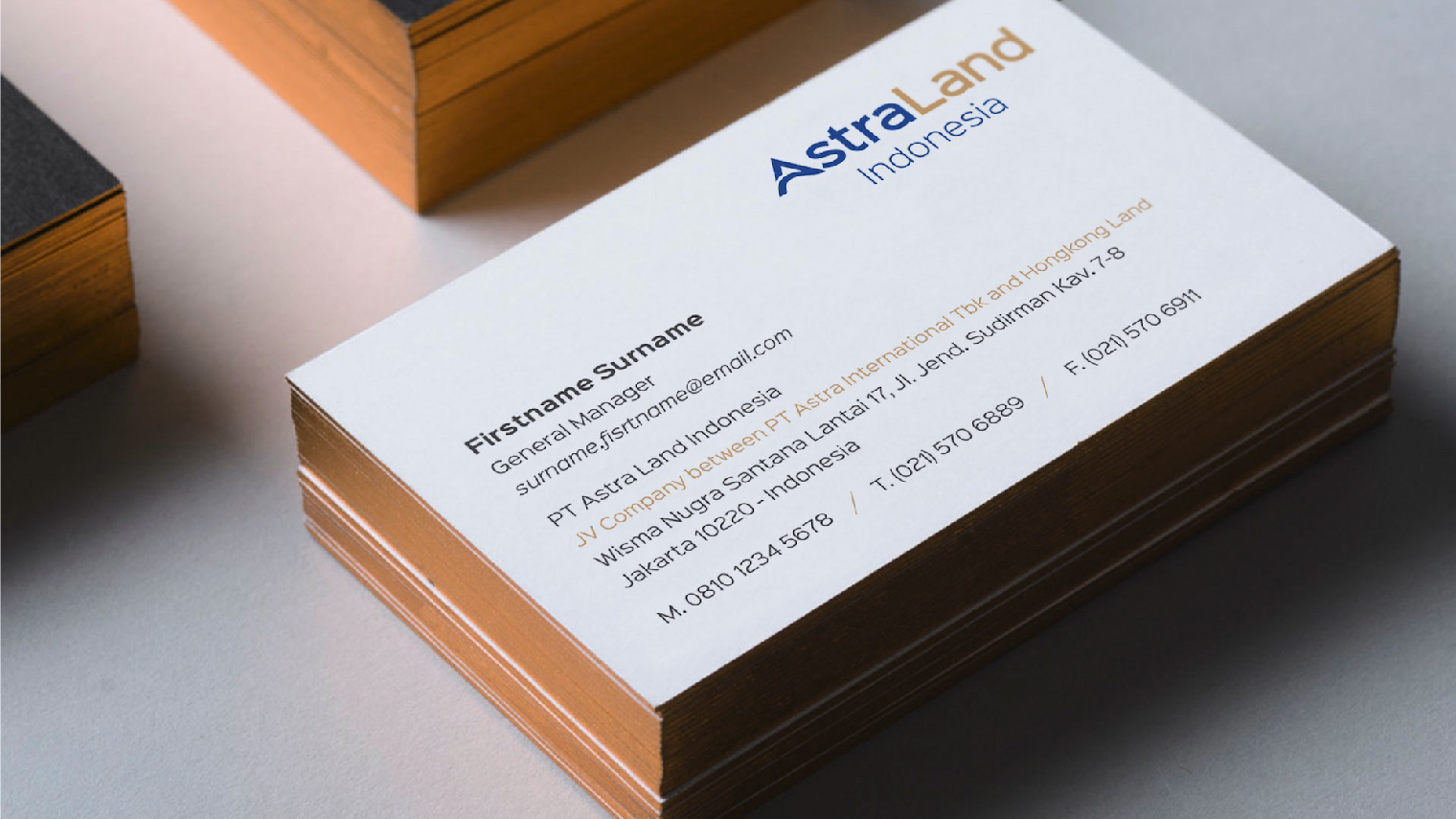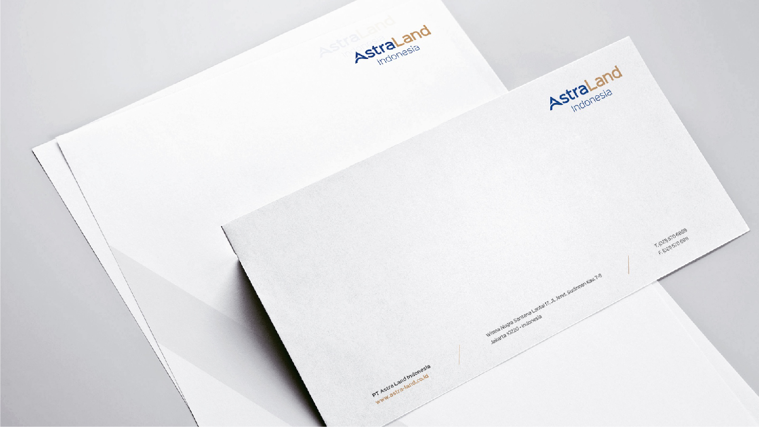
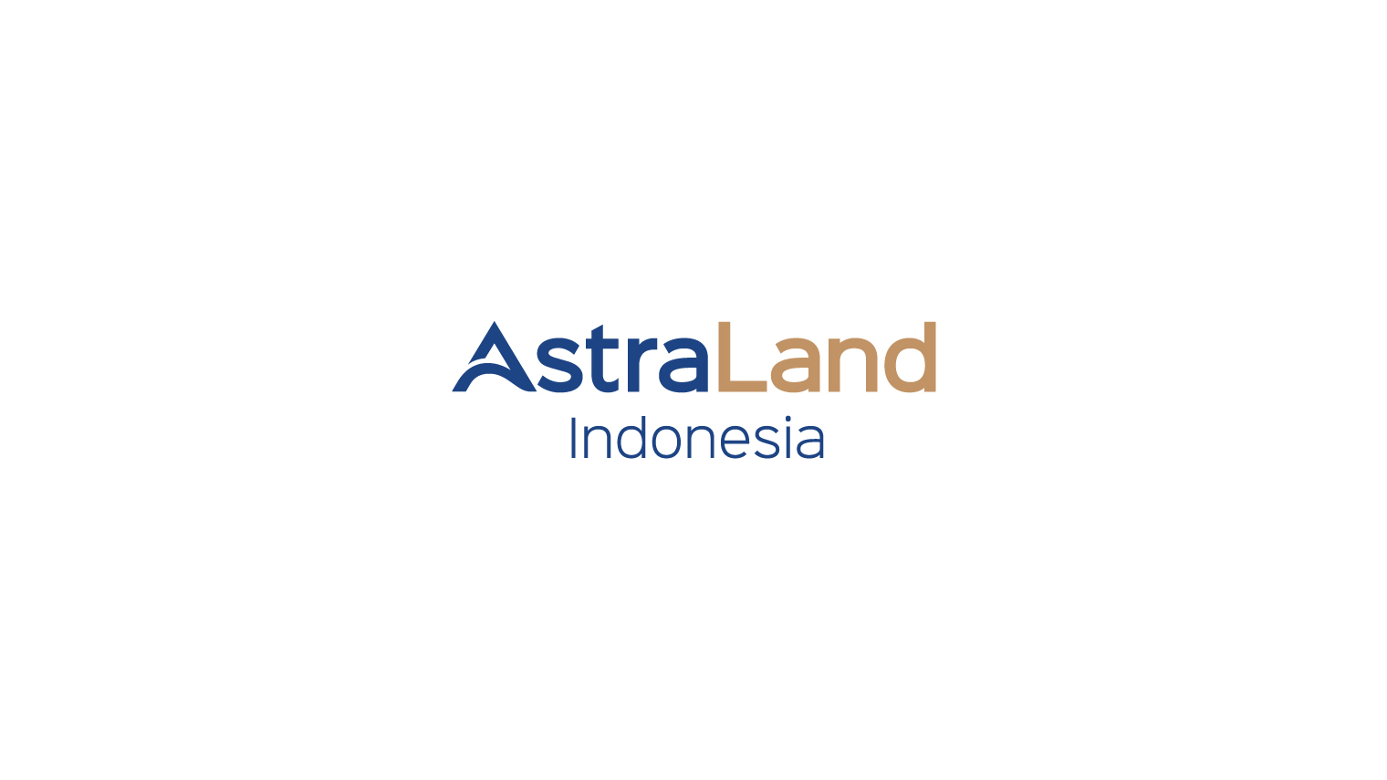

Astra Land Indonesia is not just a branding project; it is a collaboration that marks a milestone in the continuous growth of both Hongkong Land and Astra International. Through leveraging opportunities, developing accessions, and maintaining synergies, Astra Land Indonesia aims to broaden its reach within and outside of Asia. WKB was entrusted with the task of developing the master brand identity, starting by forming its core element – the brand logo.
To position Astra Land Indonesia as the most desirable, responsive, and compelling property group in Asia, we meticulously crafted a logo that preserves the esteemed reputation of both Hongkong Land and Astra International’s quality, while introducing new values of collaboration, creativity, solidity, and accuracy. The logo is a simple logotype that features a perfect blend of Astra's deep blue and Hongkong Land's rich gold colour, and the upward arrow symbol on the letter “A” denotes the start of an ascending journey towards future success.

