The challenge presents itself from the beginning: crafting a comprehensive branding for the holding company, subsidiary and product that is integrated yet distinctive enough within one structural ecosystem. A strong global appeal is also crucial as the company aims to engage in the international landscape.
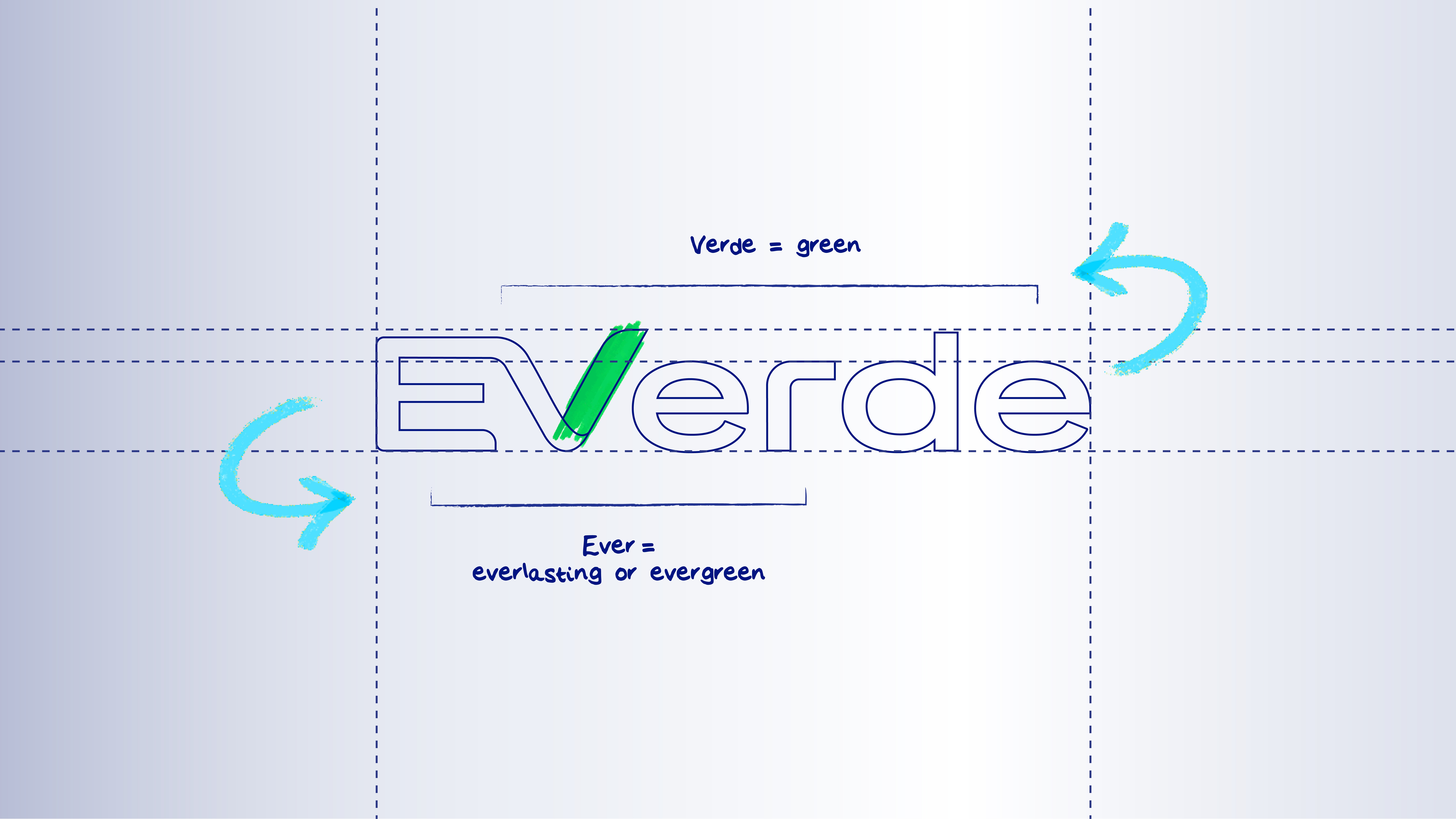
We dived deep into intensive research and analysis on a global scale that sparks the building of a well-structured branding system for the identities of Samasta, Navasta, and Everde. Each identity was meticulously and cohesively developed, with the name ‘Everde’ chosen as it perfectly represents a daily partner with everlasting energy that accompanies consumers’ journey to a greener world. The logotype ingeniously connects the letters ‘e’ and ‘v’ for a simple industry symbolisation and further utilises its company’s (Navasta) iconic ‘v’ as Everde is a manifestation of its vision for vast positive impact.
