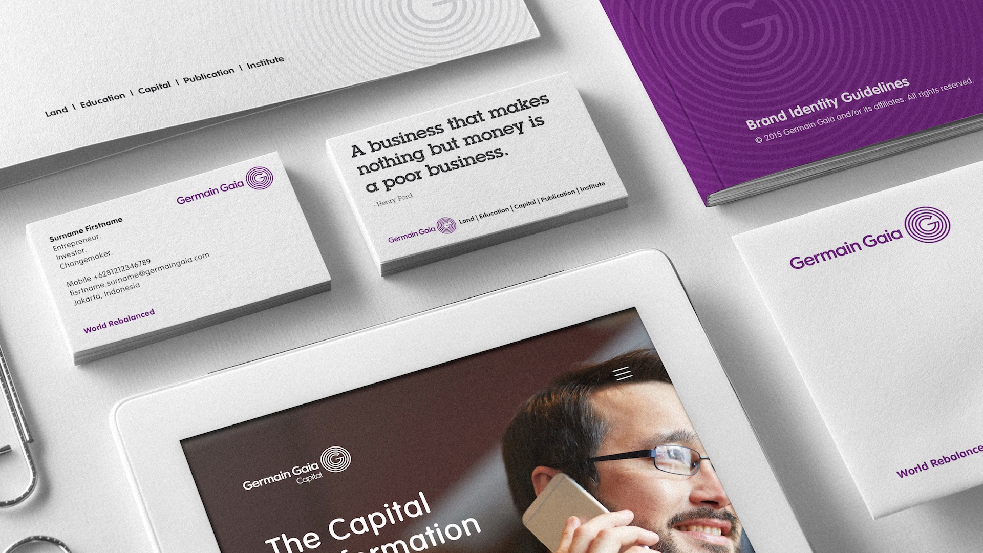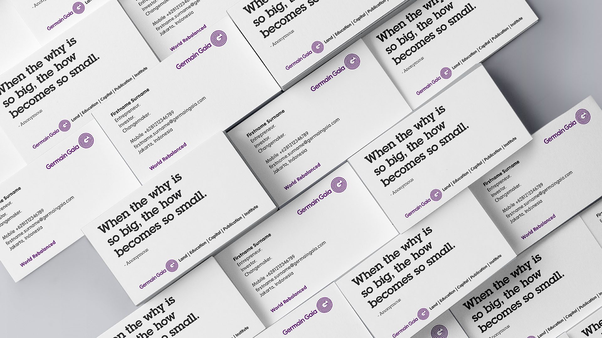


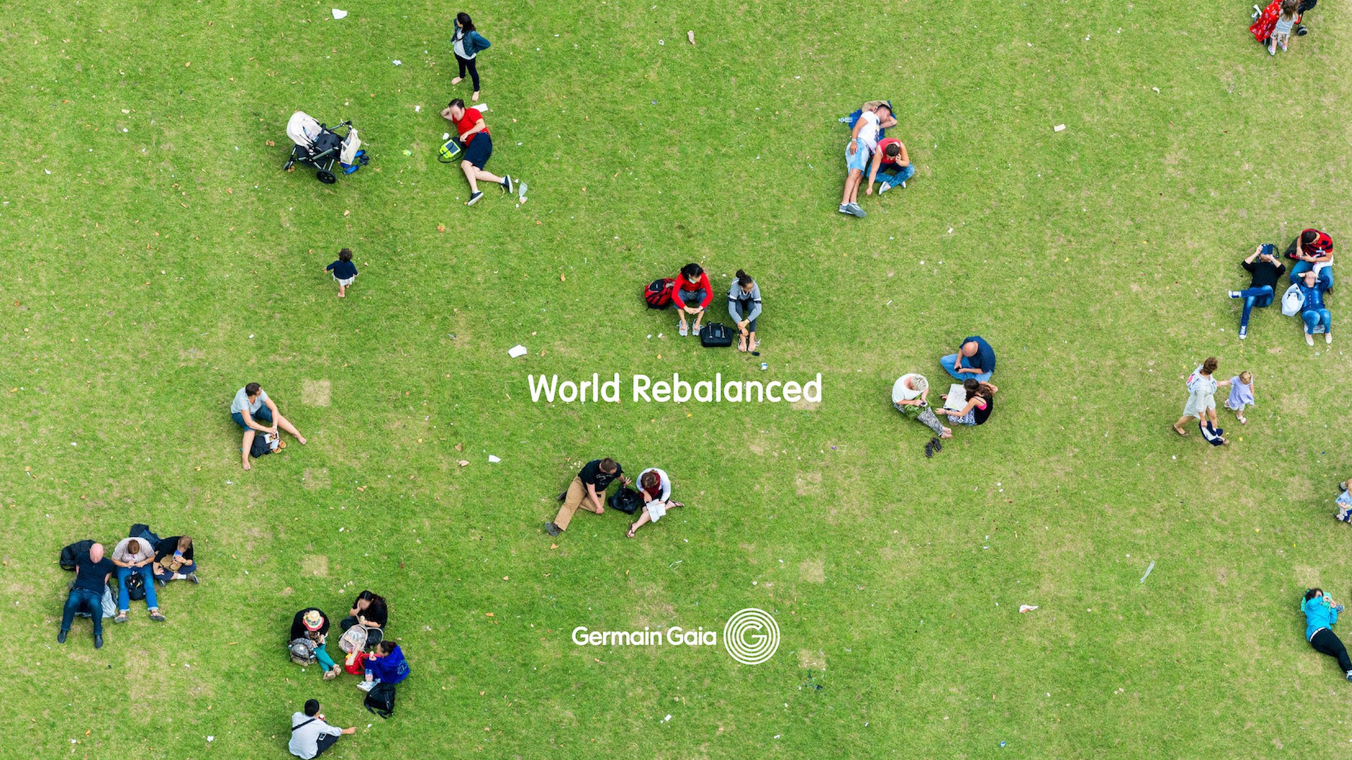
After understanding the brand’s aspiration and we were assigned to create a corporate identity out of it, we categorized this project as a noble mission. Although centered on social concerns, the company, is however, must balance the portion of its social-minded and its capital-minded. The company should perform in line with the time so they can embrace the current and the future.
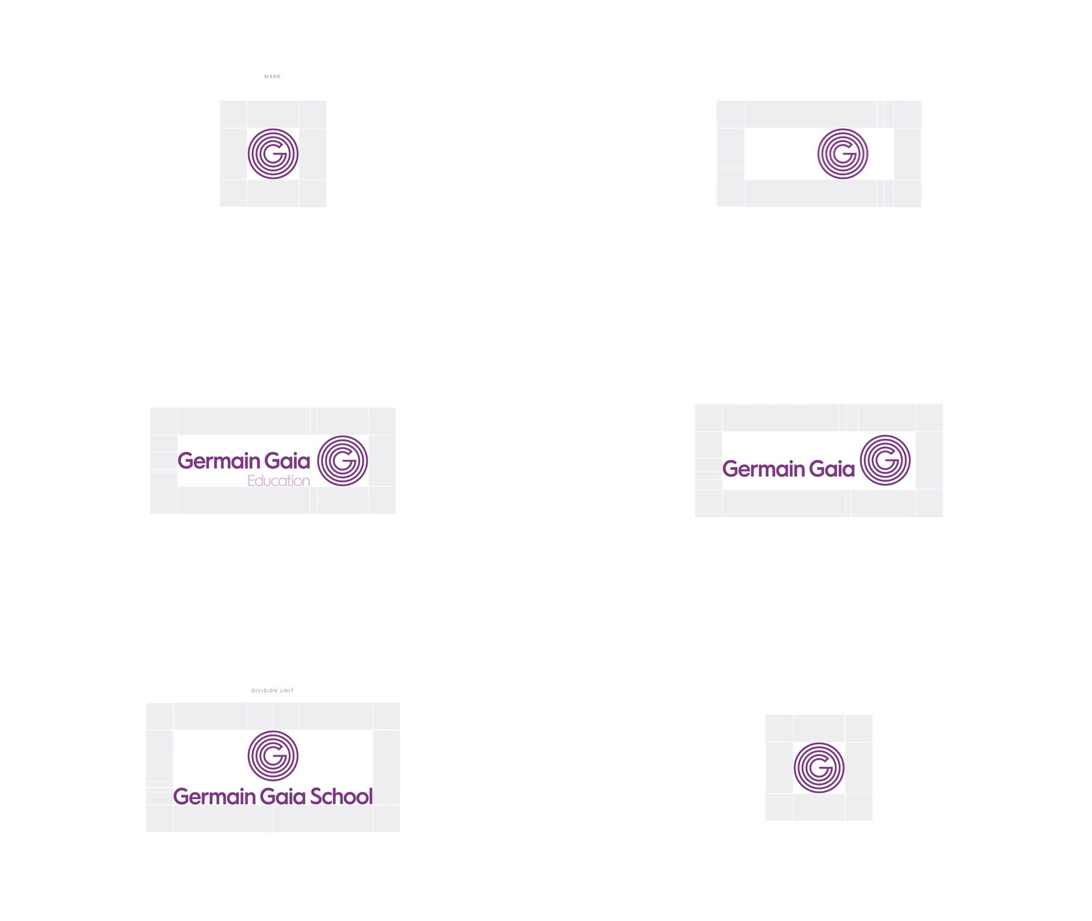
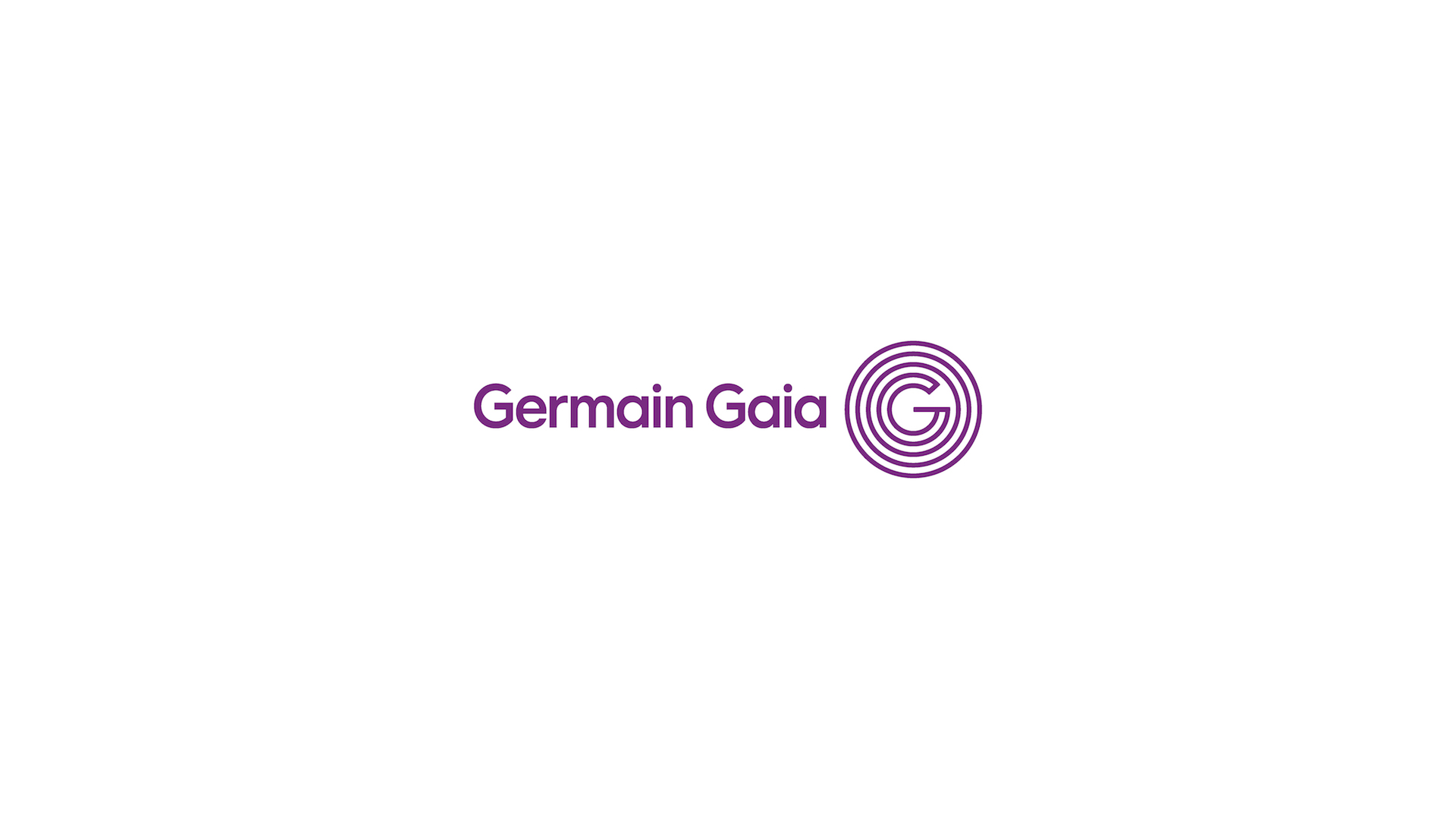
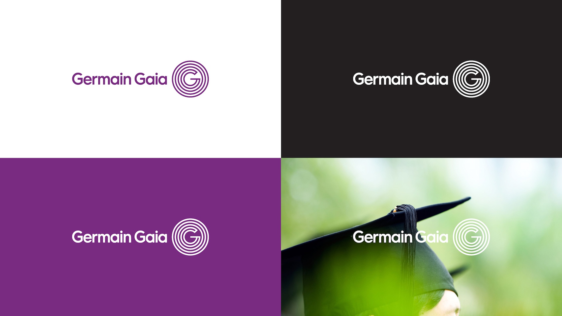
While having ‘balance to mother nature’ as the main message in mind, we got inspired by the concept of ‘Ripple of Influence’. After offering various logo alternatives, the chosen logo does not only epitomize balance, but also visualized movements. You can see it as a drop of water that spreads or also a light of exposure. It looks like a ripple, and the ripple speaks for good deeds, balance and hence, positive influences. Finally, with the new logogram of initial and other supporting graphic elements, the brand look strong and their philosophy can be grasped competently.
