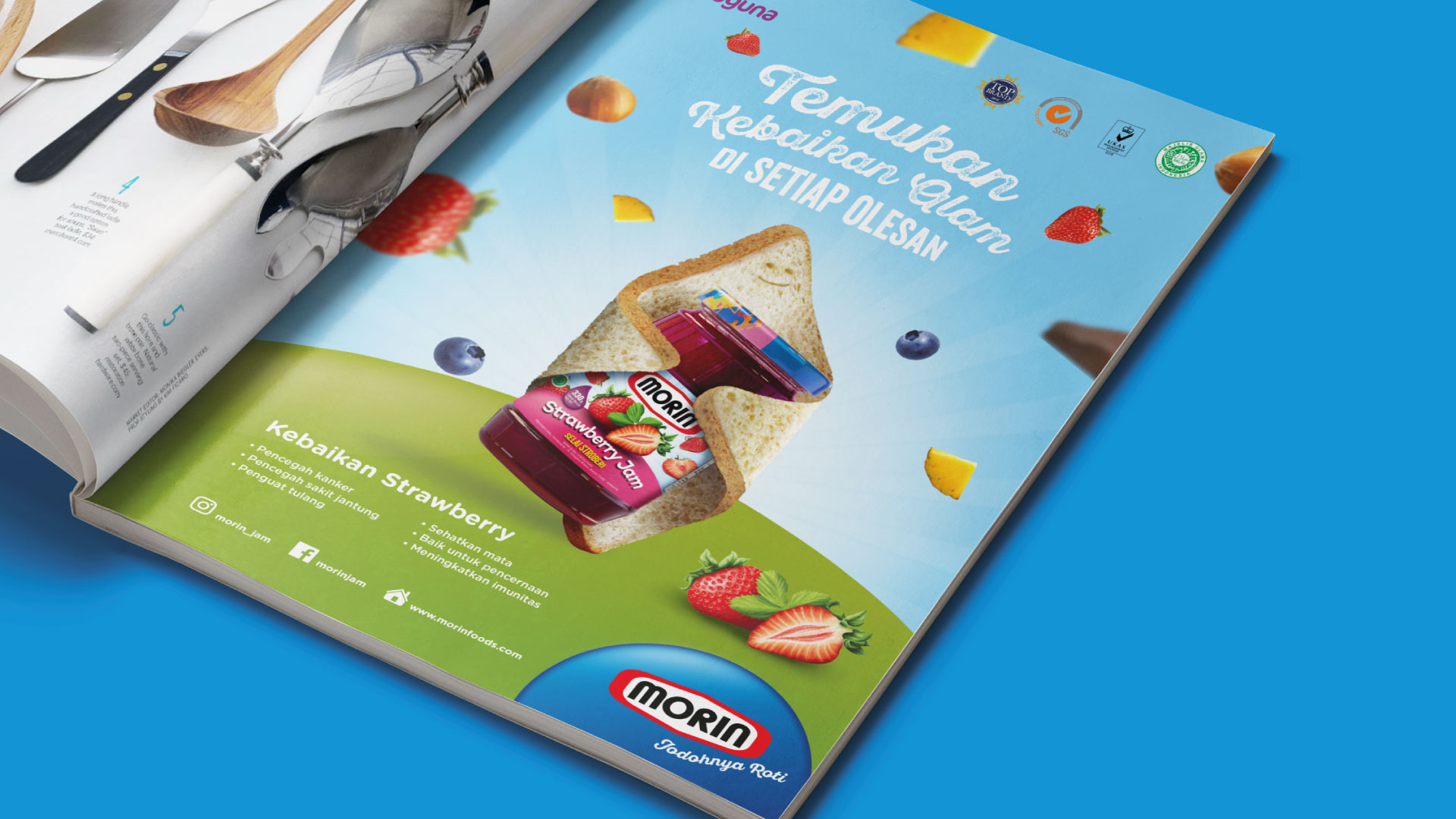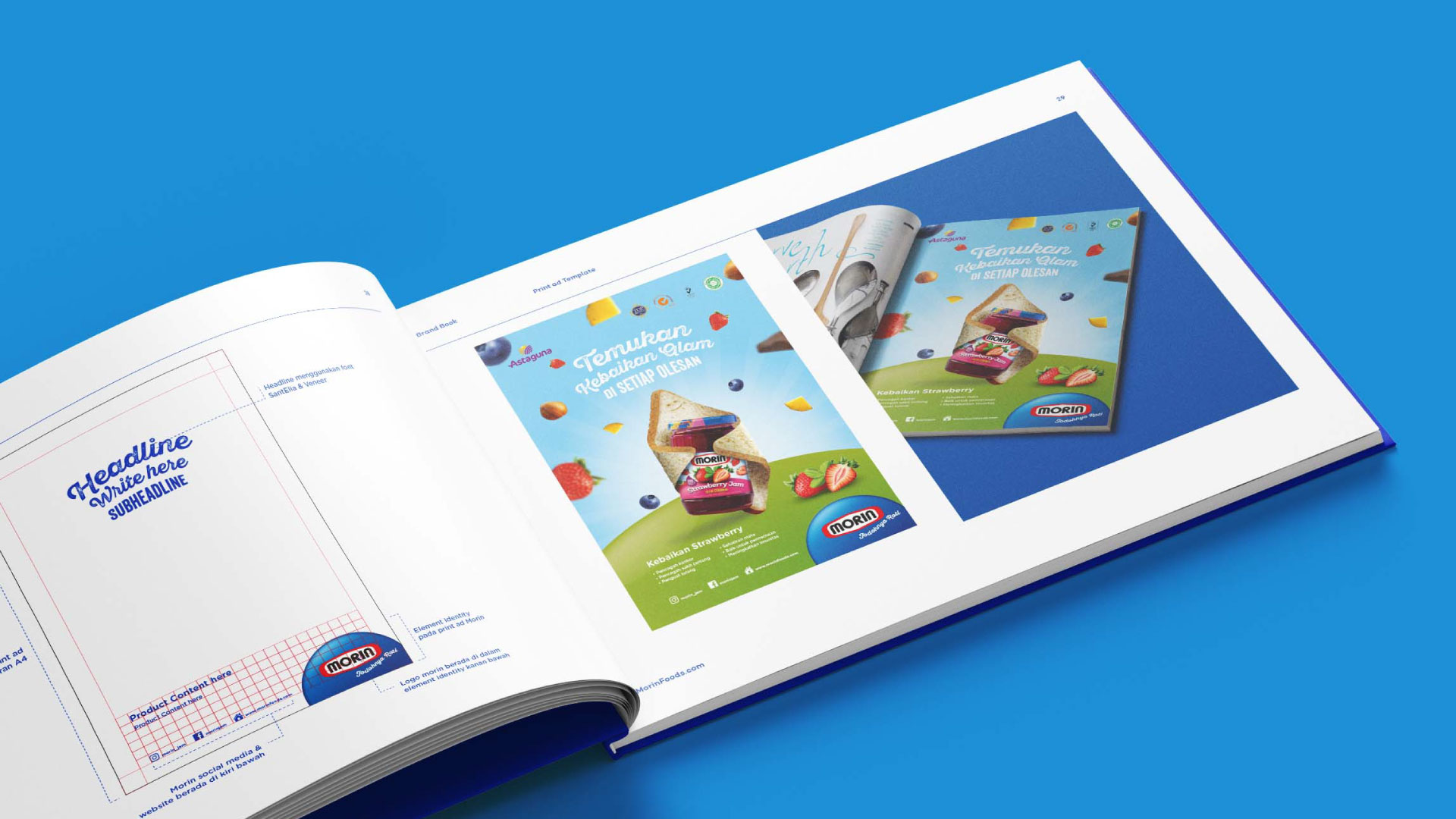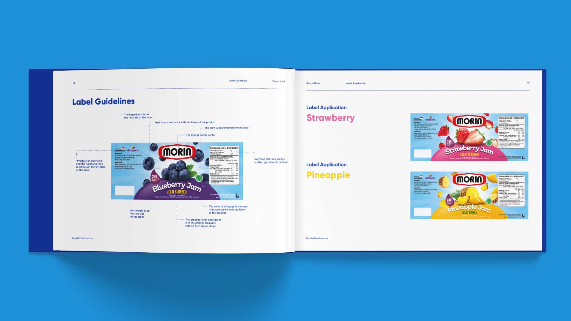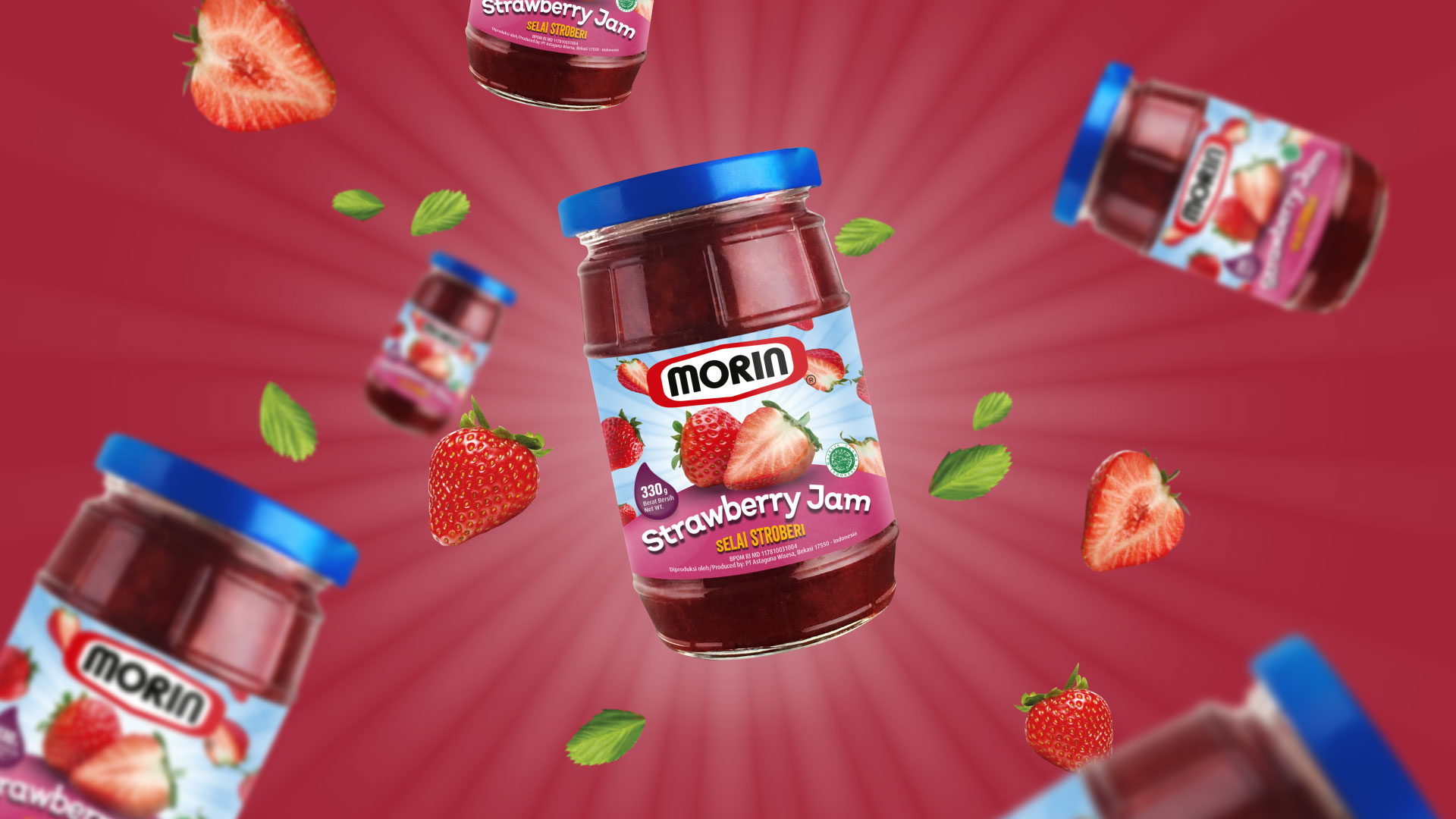

Despite being renowned as the most favorite jam brand over the years, an ever changing market marks a milestone for the brand to evolve in present trends and future relevancy. With that, WKB was challenged to rejuvenate this lovely brand to set a new aim; gain a deeper connection with its customer and freshen up the values with the creative approach of label redesign.
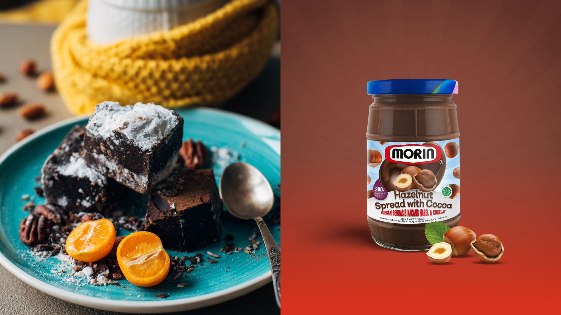
Starting from the existing design that was widely known, we outlined the word of reconstruction as our strategy; not so radical but a moderate approach to retain the iconic identity of the brand. Therefore, we focused on details to make a big impact. The freshness of the design is improved with lively, crisp and vibrant color matched with firm typefaces. The redesign successfully showcased the high quality of the products, trusted to delight families of the nation.
