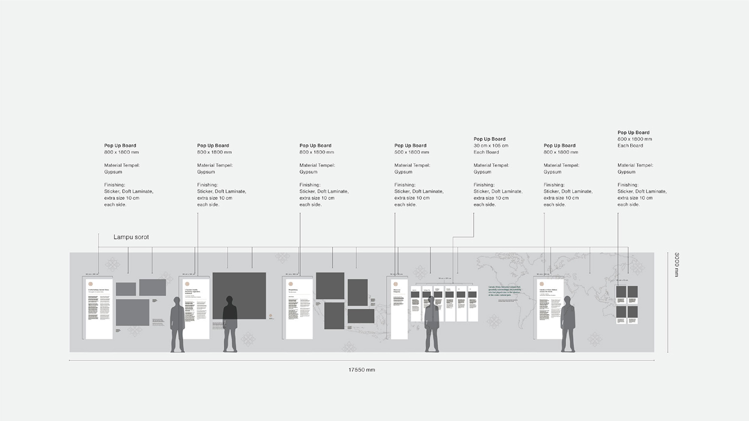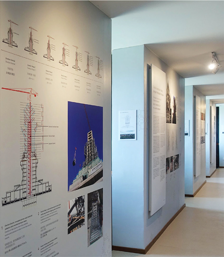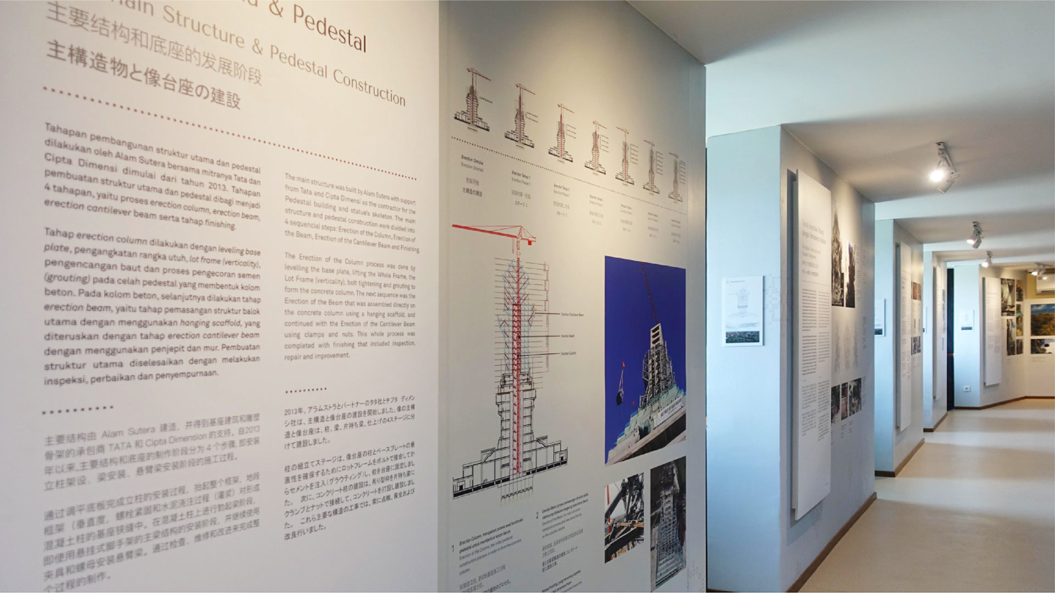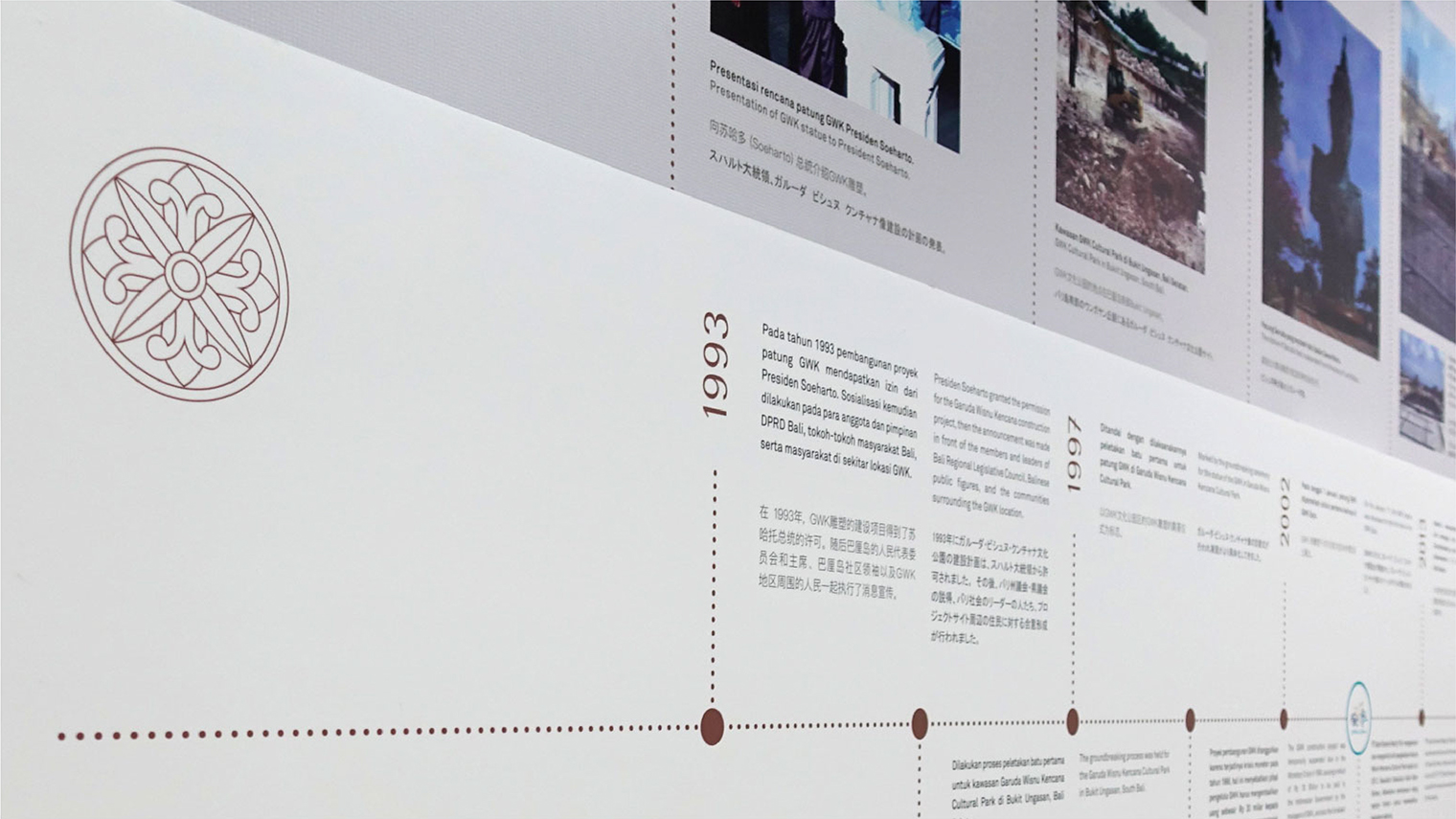
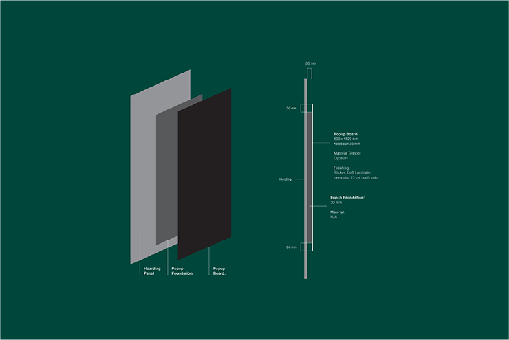
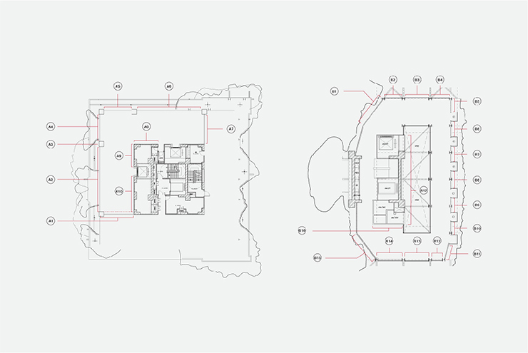
Running the exhibition within the statue's body, the exhibition was divided into two sections: the stories section at the 9th floor and the technical process at the 23rd floor (which is located at the wing's part of the statue). Besides managing the flow, designing the technical information to become interesting, was another challenge. Thus, the team must ensure to create an otherworldly visual language – turning data into something that is visually attractive and balance in both space and usage.
After exploring the initial archive and holding an in-depth interview with Nyoman Nuarta, the sculptor; Waykambas team finally came up with a design scheme that combined classic elegance and a more contemporary interpretation of the sculptor's development – by using vector-based design to build a simpler, modern look over the real statue's complicated construction.
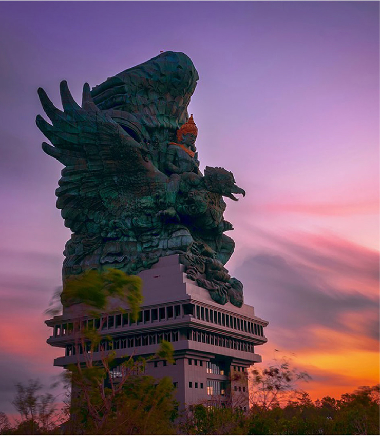
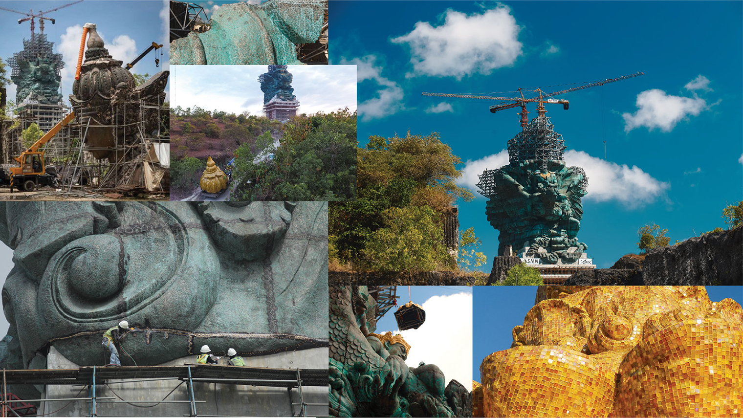
Bold yet elegant colours were spread across the exhibition to bring the graphic content to life. Inspired by the statue, the "green-bluish colour" was a result of the statue's colouring process with patina acid being sprayed all over the skin to accelerate the copper oxidation process. The "gold colour" was taken from the gold mosaic technique found in Lord Wisnu’s statue, while the "reddish-brown" and the "grey colour" was inspired by the material mixture of copper and steel.
Now fully installed, GWK Statue is regarded as one of the tallest statues in the world, which is also a modern manifestation of an ancient icon that is expected to be a centre for world cultural development.
