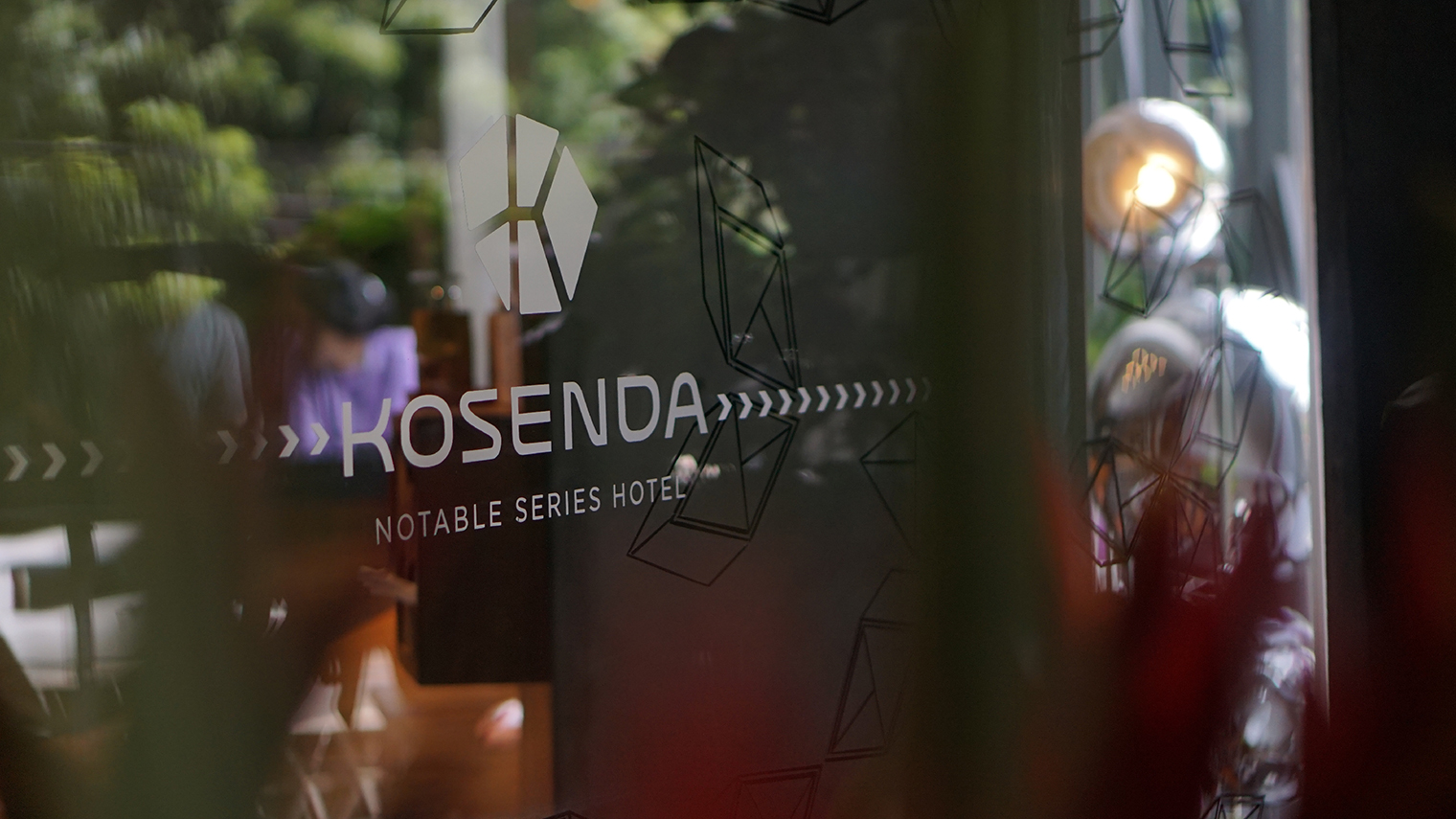
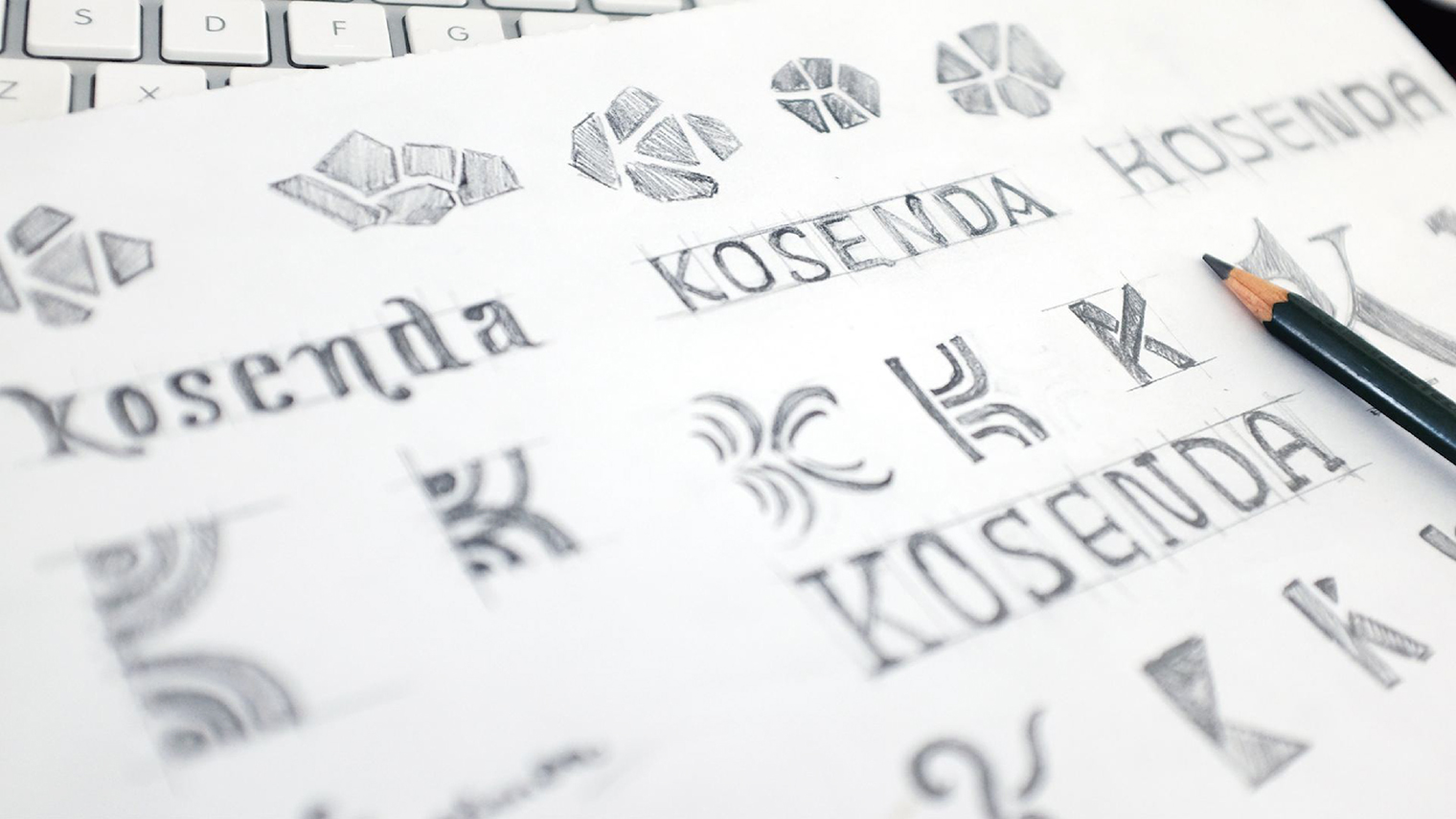
Being an avid traveller himself, Mr. Ruben Kosenda has unlimited ideas and boundless imagination. It needed deep hearing session accompanied by abundant cups of good coffee and fried cassava, to formulate the right design platform and brand strategy that can suit his character and aspiration -to create an urban utopia in the heart of Jakarta.
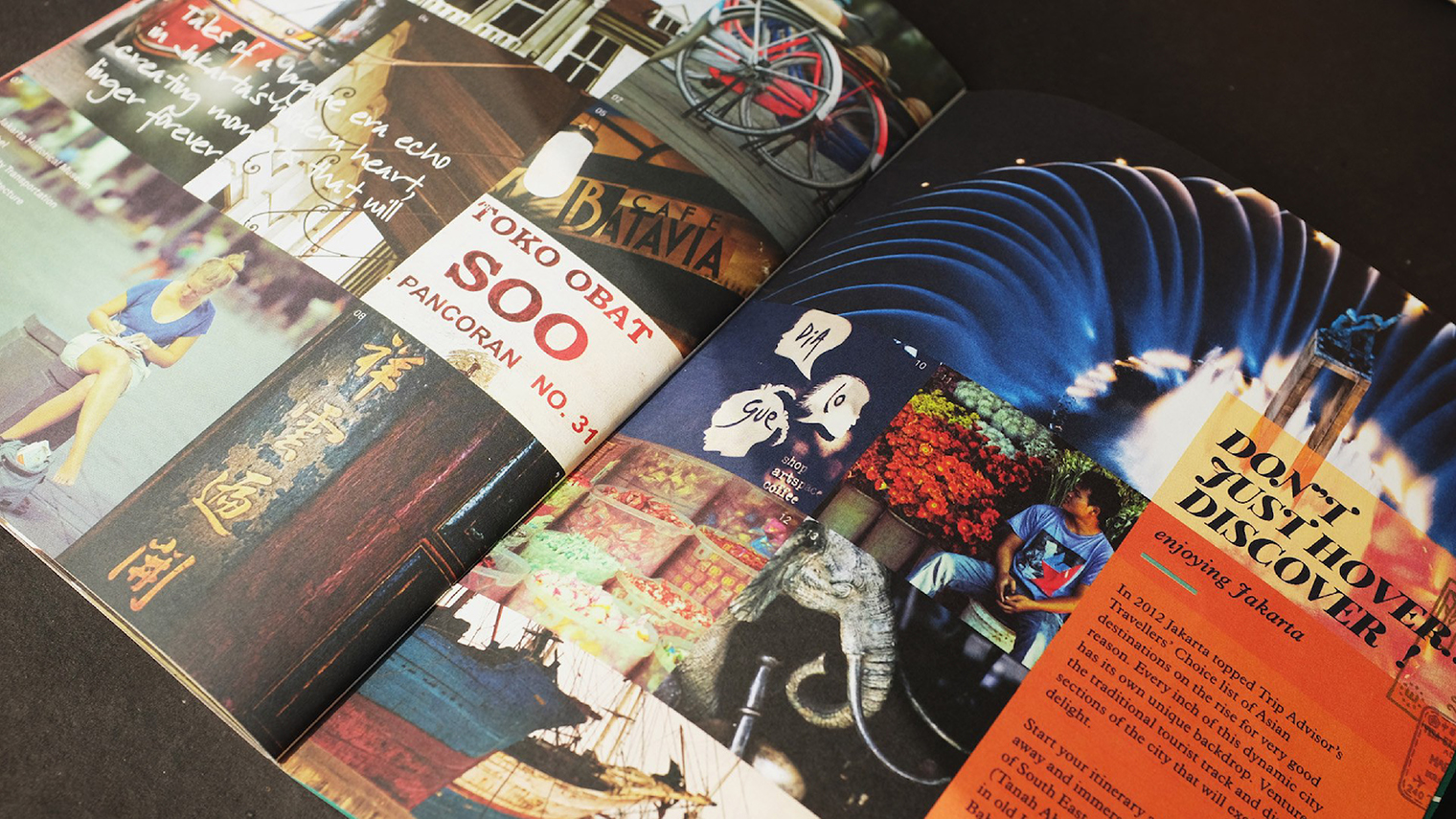
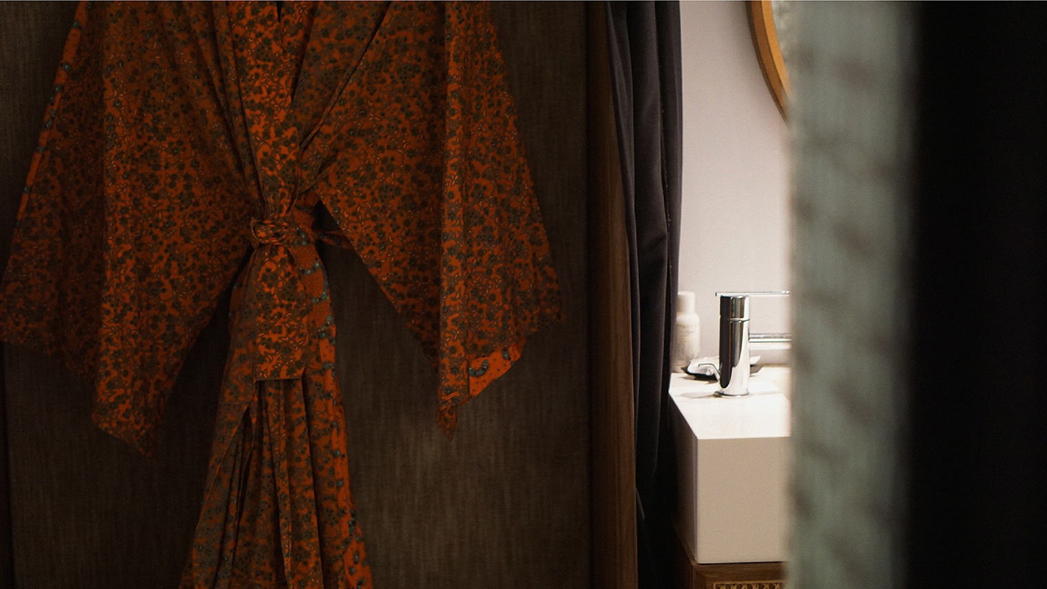
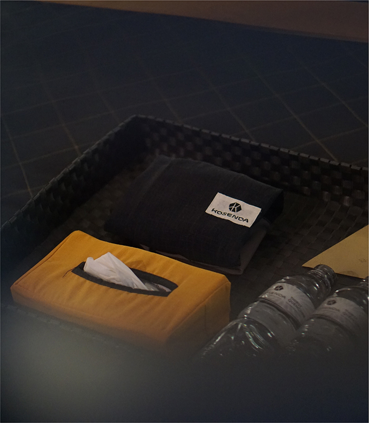
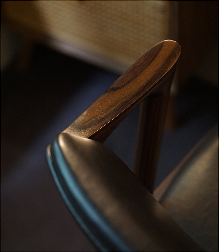
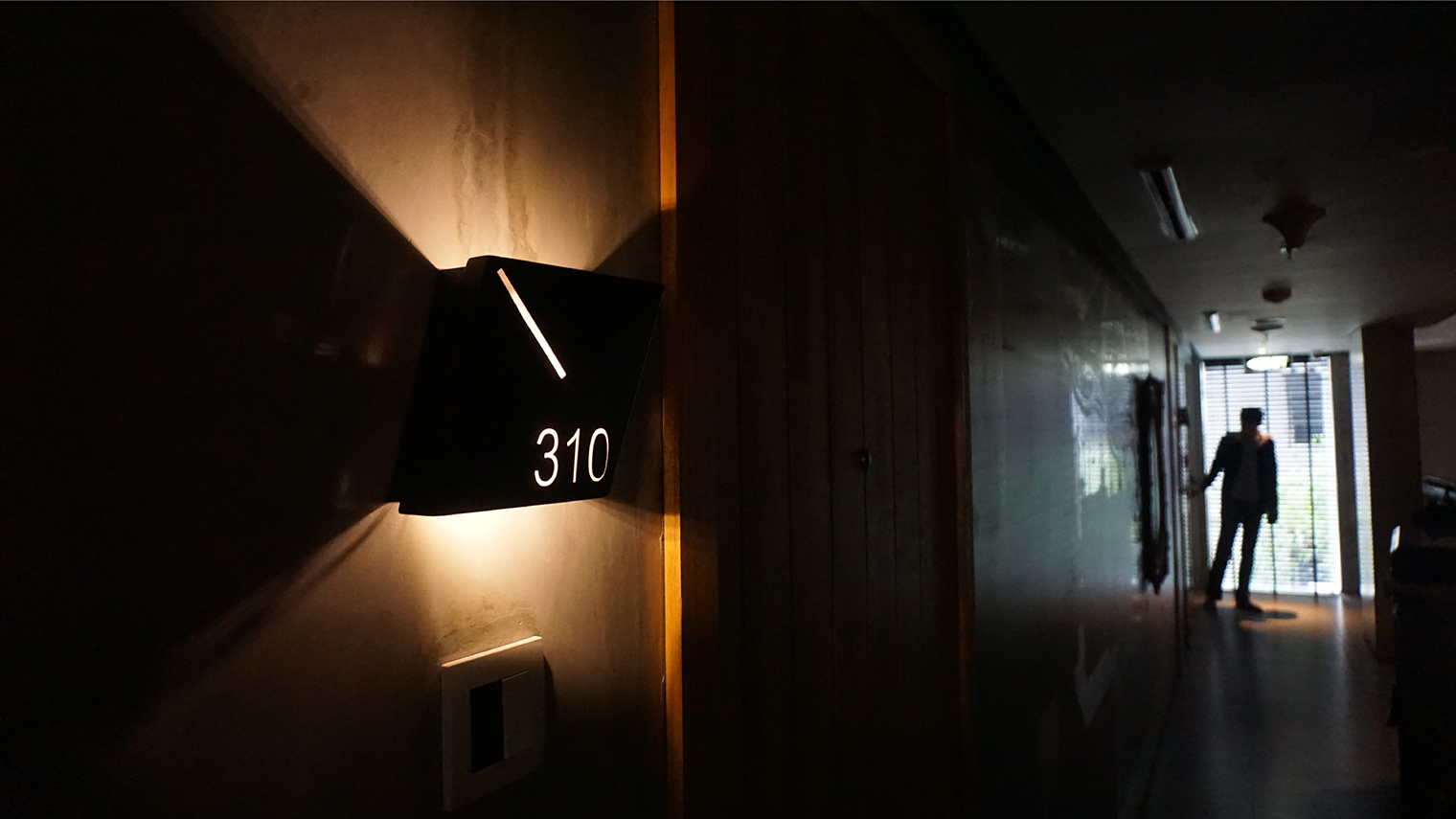
Edgy yet cozy. Sensible yet rebel. Local taste bud yet International standards. Contradiction is our keyword in developing Kosenda’s identity. We created the logo and completed it with ’Notable series hotel’ tagline, as a platform to avoid one style strictness that will limit the founder’s creativity. Through various brand channels, starting from logo, signage, digital experience, catalog, welcome booklet to in-room experience, we want people to truly feel and enjoy Kosenda, trapped in its maximum comfort.

 Arbor&Troy