
The project called for an exploration of implicit visual expression, requiring a careful balance between nuance and clarity to shape a sophisticated identity aligned with its audience. It also required a strong, trustworthy presence suited to multiple generations.
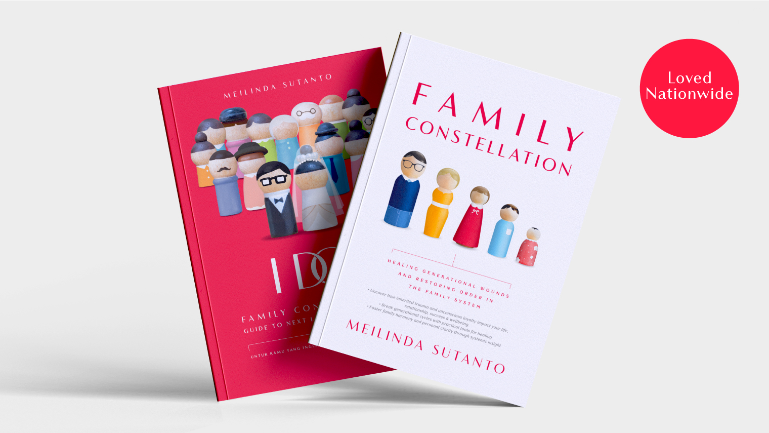
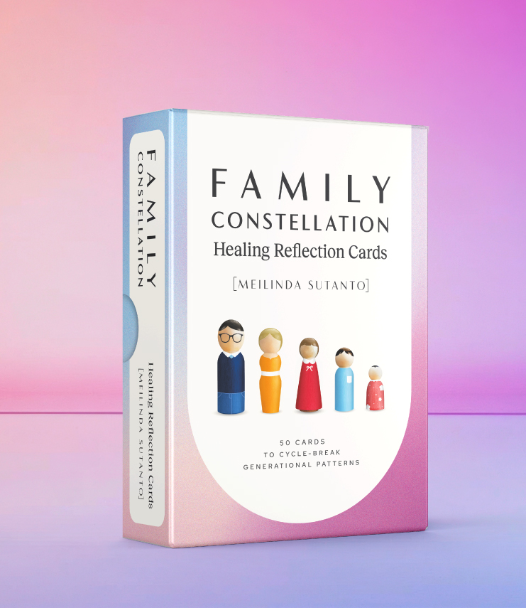
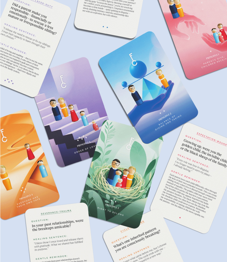
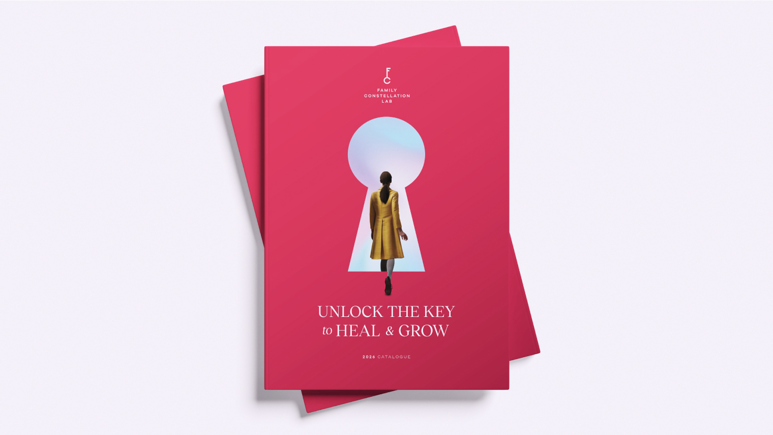
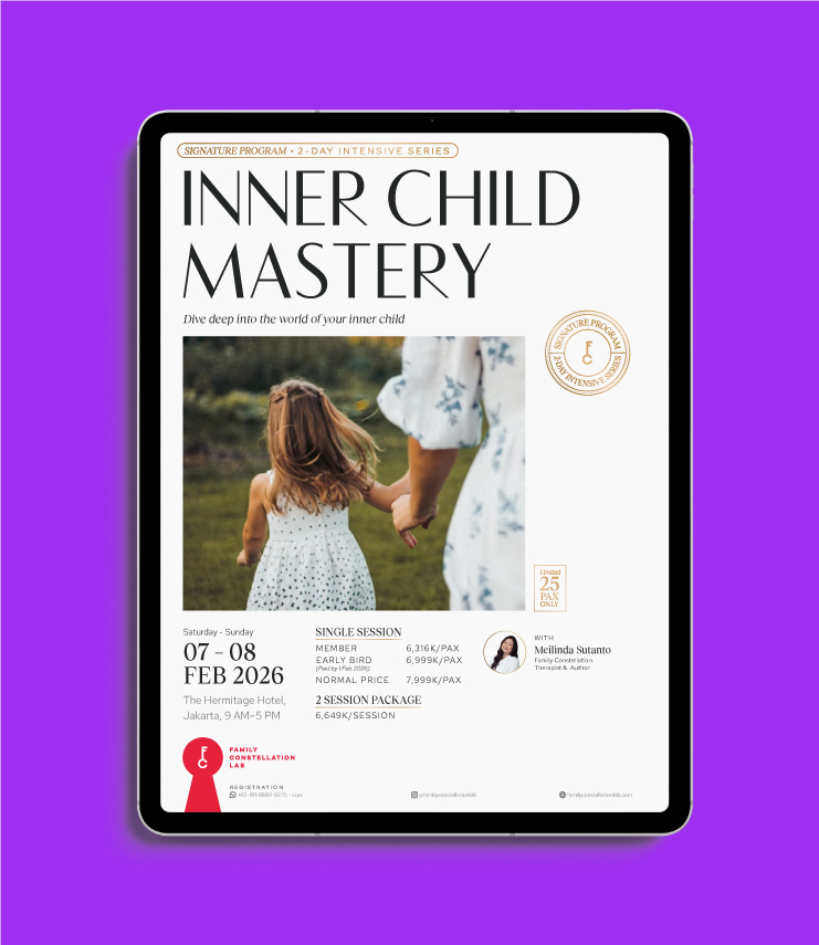
At the time, the project’s vision carried the client’s name, but through the process it evolved into Family Constellation Lab. We shaped the brand’s initials, FCL, into a key, paired with a keyhole as a graphic element—capturing the idea of unlocking past wounds and opening new beginnings. The identity extends across marketing collateral, social media templates, and book covers for the nationally acclaimed titles ‘Family Constellation’ and ‘I Do’, positioning Family Constellation Lab as a symbol of modern generational therapy.


 KEMLU - PPTM