
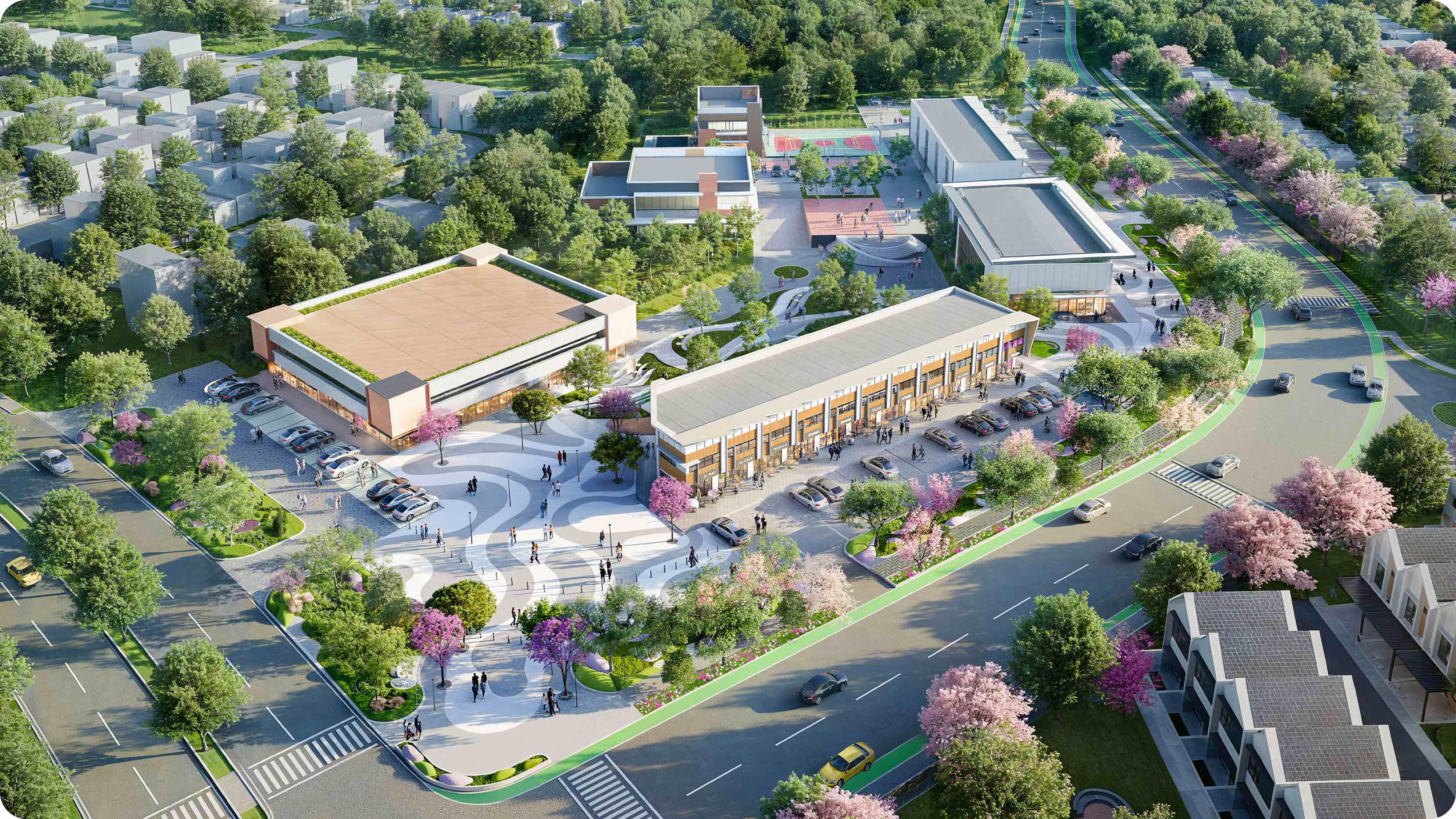
The brand had to energise without overwhelming. It needed to bring life and movement into the township while staying true to Green Bestari Park’s identity. With diverse functions and a wide age range to serve, the challenge was to create one cohesive brand that feels natural to engage with, inclusive, and exciting for everyone.
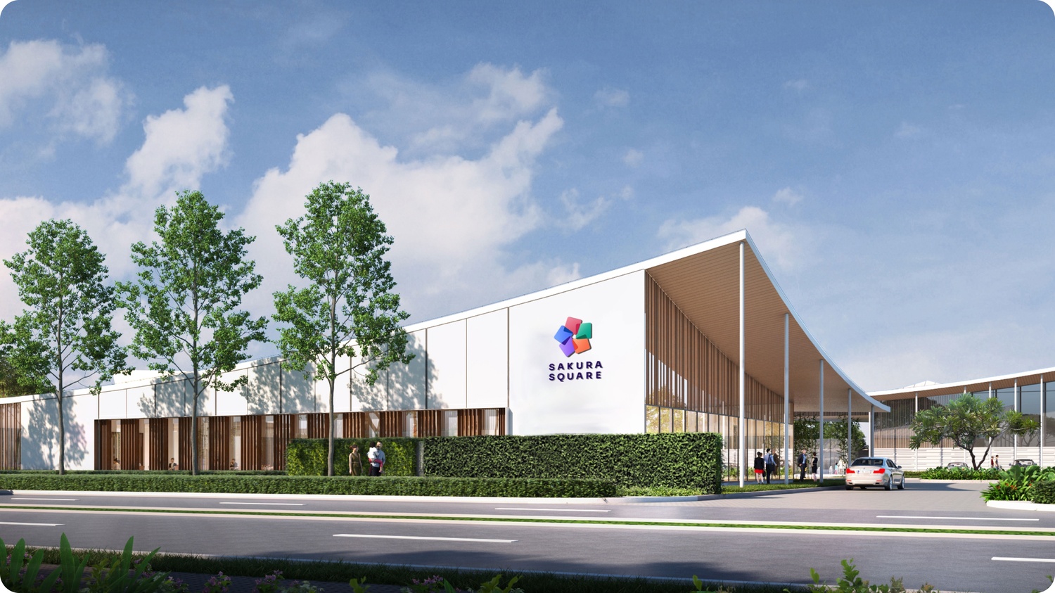
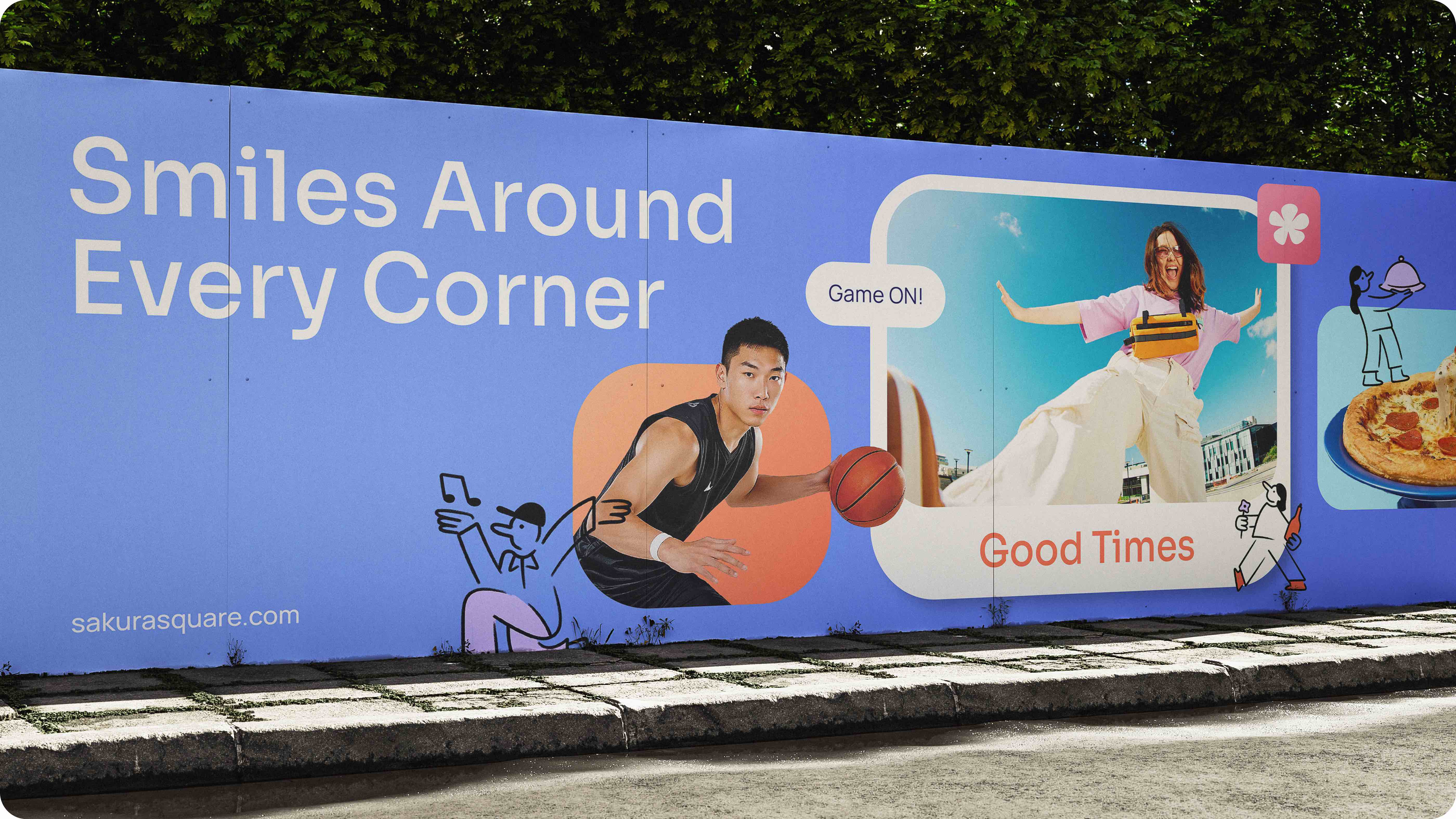
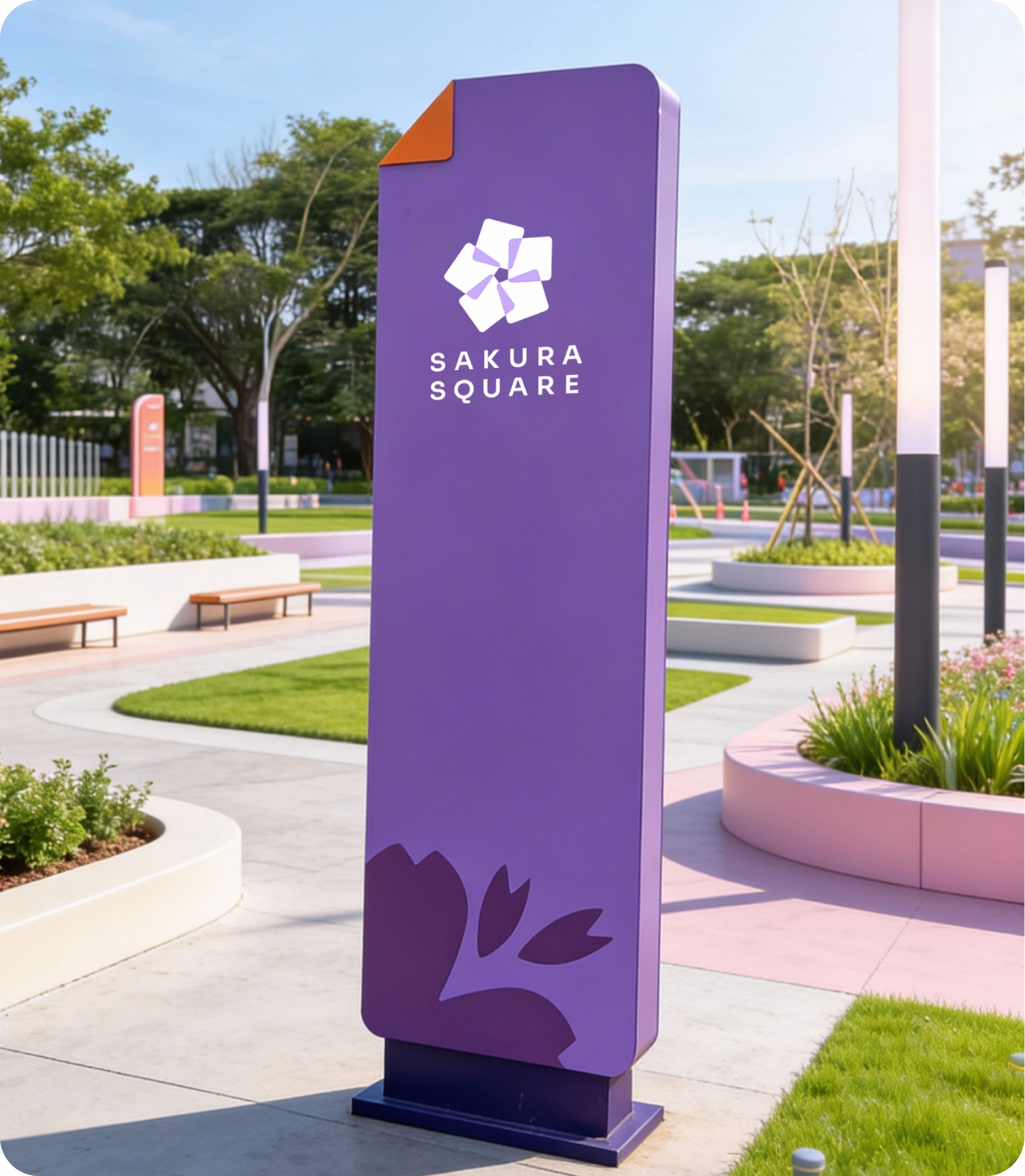
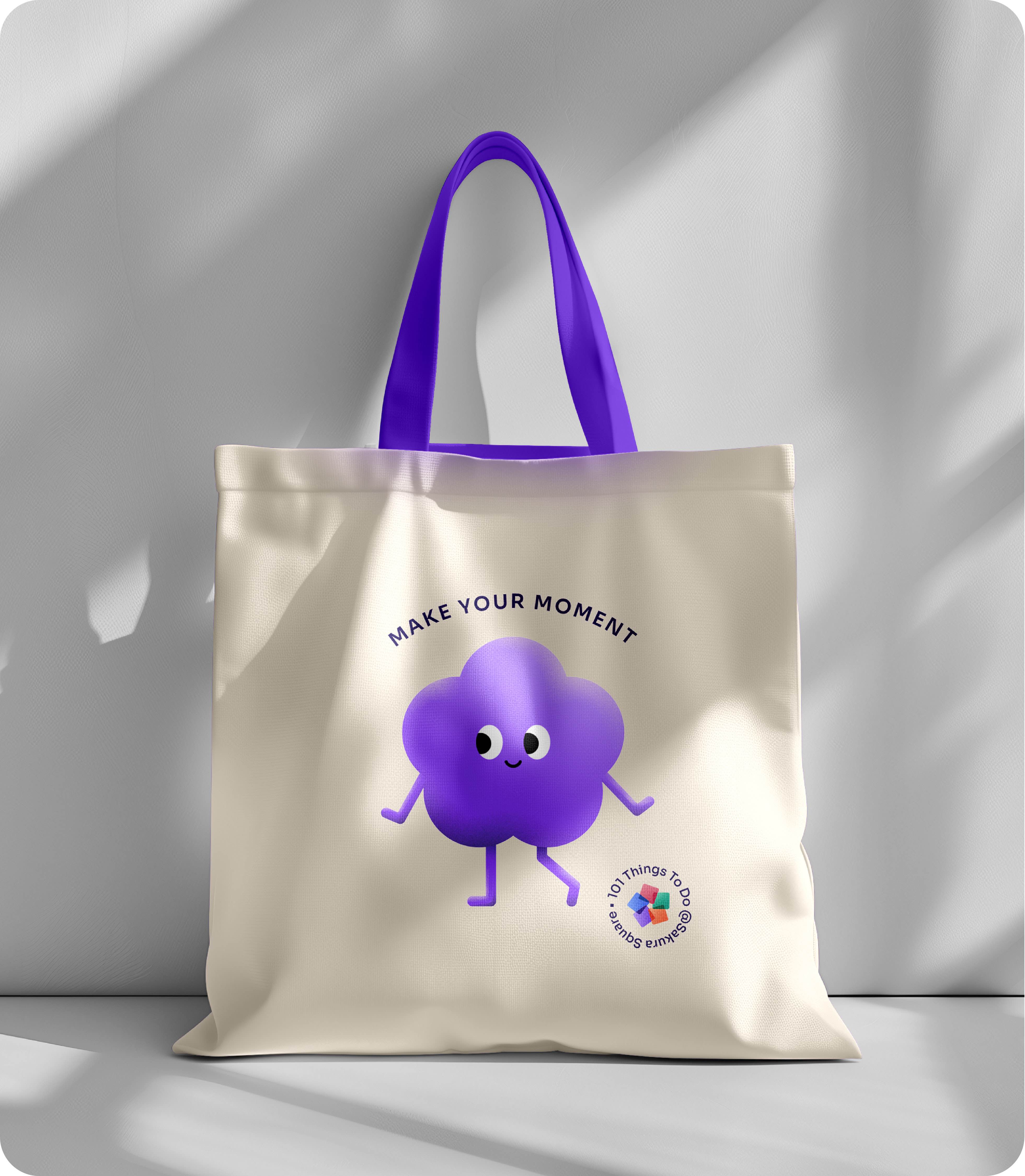
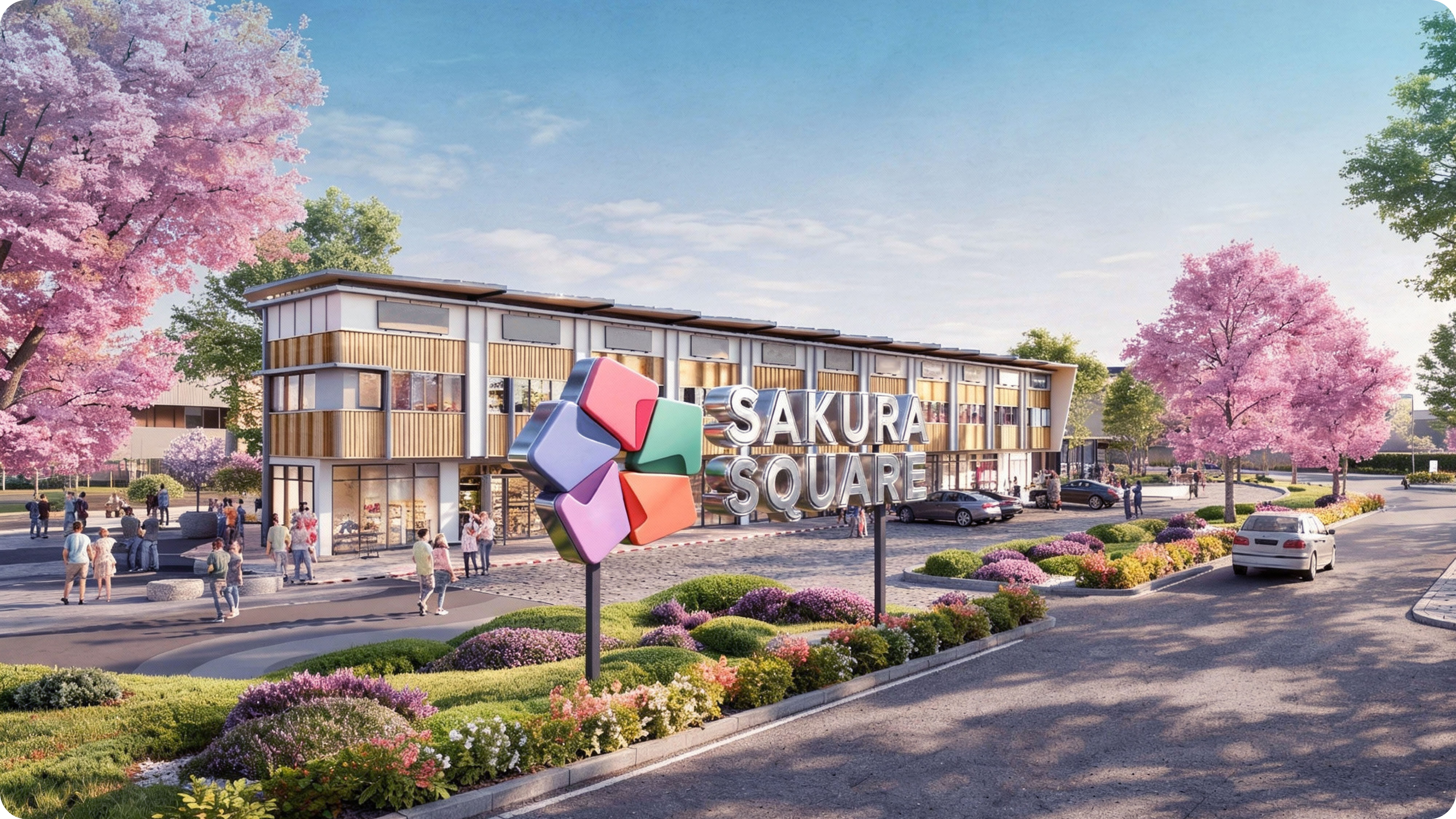
We designed a one-of-a-kind brand phenomenon named Sakura Square. Inspired by the beauty of sakura flower, the name reflects a rare and delightful experience that feels special every time it blooms. This idea comes to life through a logo shaped by five colourful squares arranged like flourishing sakura petals with each square represents a different activity and energy. We form it in a cohesive system with colours, graphic elements, and imagery. The result is a brand that expresses a destination that feels alive, dynamic, and full of moments worth returning to.


 Tempo Scan Group - Natural Choice