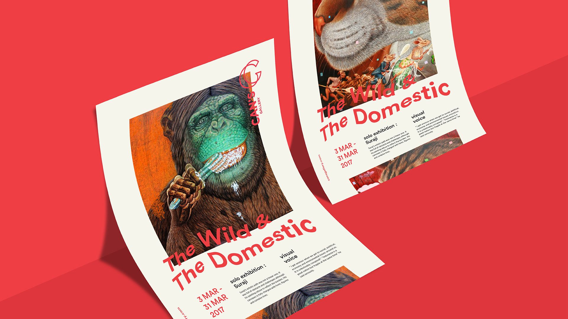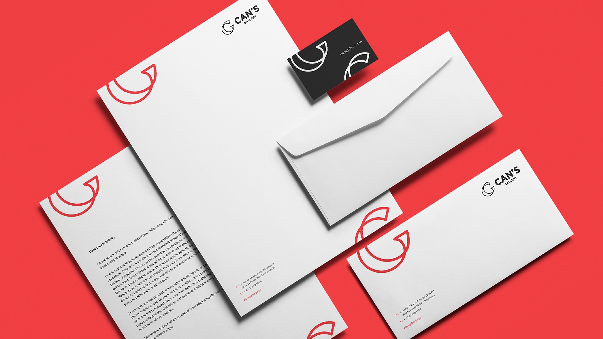
From rethinking the logo's concept to the new brand visual system, the new identity must evolve and adapt to suit different audiences and changes over time. We want Can's Gallery new look to be more welcoming than ever. Opening wider doors and bring the hype in. In the same time, it must also have bold character, contemporary mindset and versatile identity to use in diverse applications and explorations.
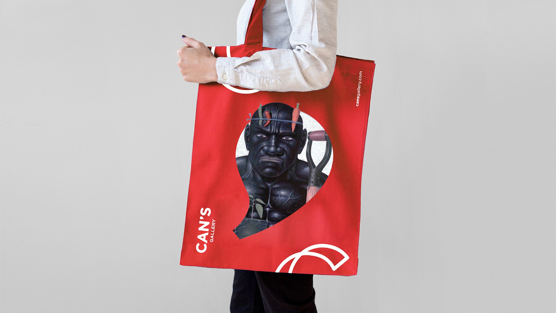
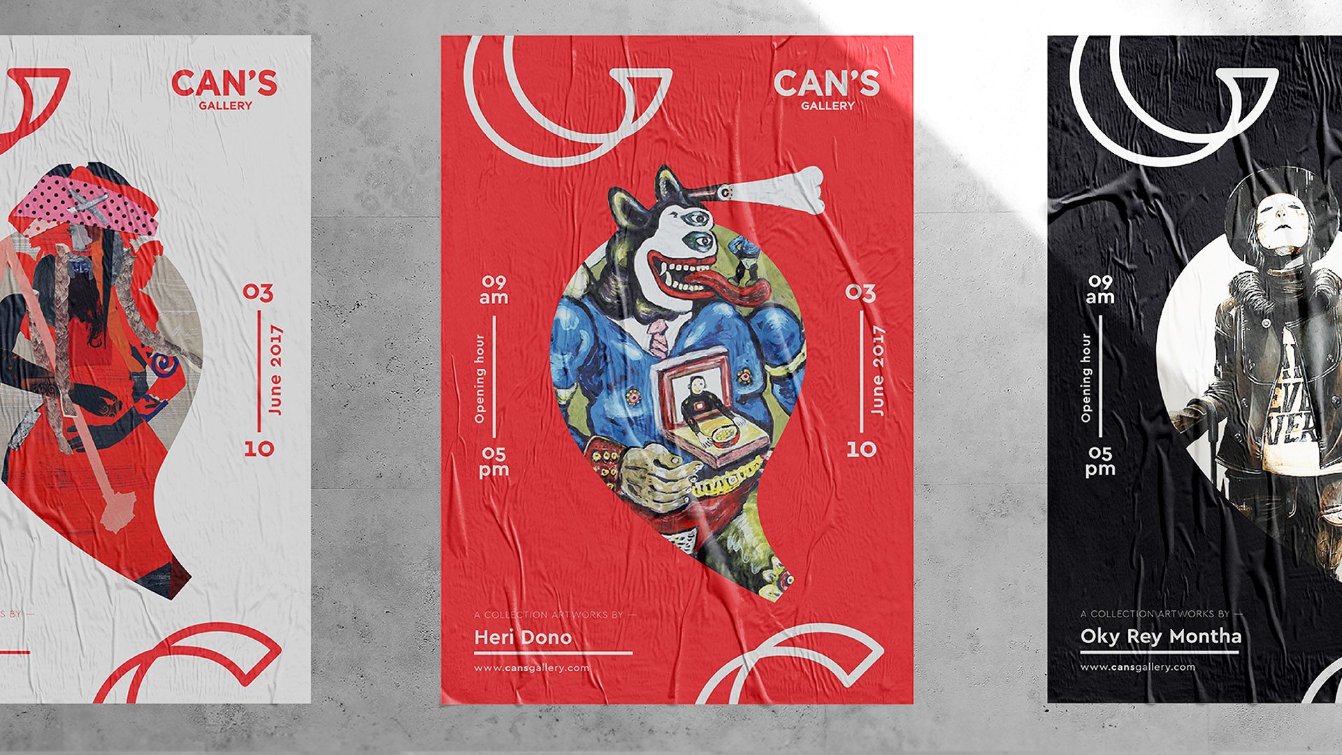
The logogram is formed from the initial Can's Gallery, C & G, that are merged together in a distinctive way. By application, an apostrophe mark is used as a graphic complement that can be filled with images or artworks of the gallery. This new logo becomes a metaphor for Can's Gallery New Visual Identity: contemporary yet evocative with historical in a surprising way. Our team of designers feels the privileged to create this new visual language that reflects a renewal energy of Can's Gallery where both artists and art lovers can gain new discoveries, inspirations, and creativity.
