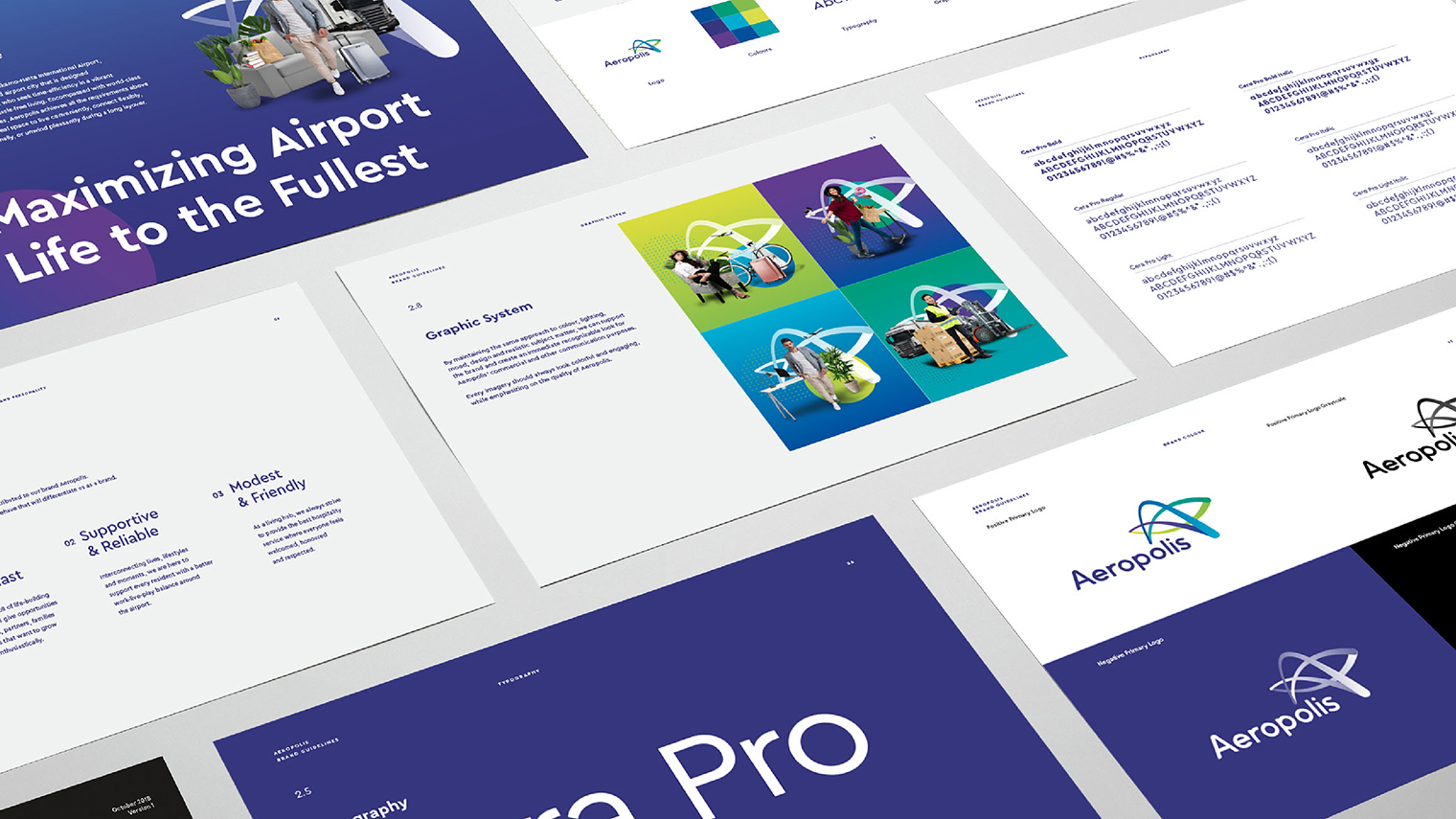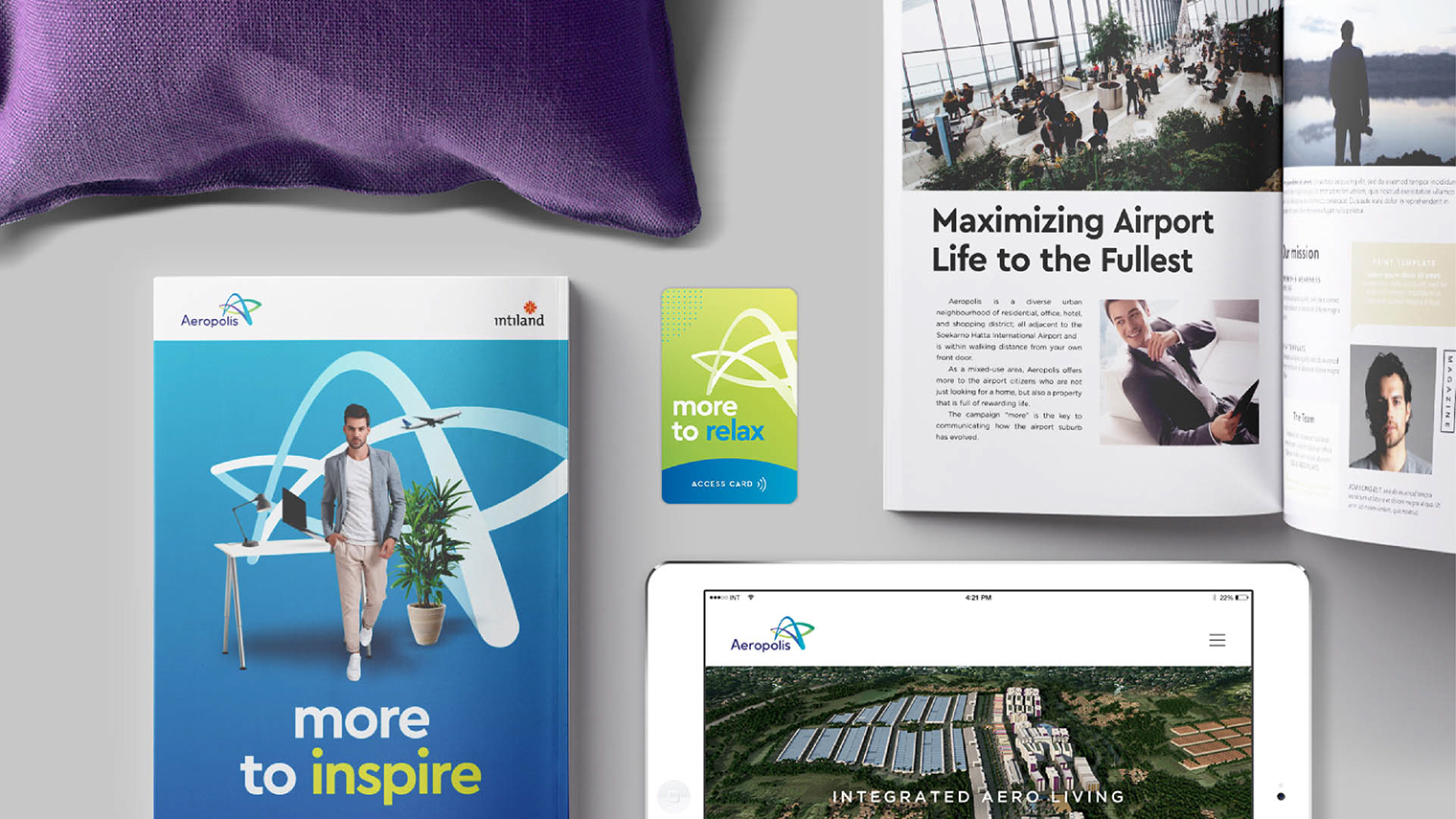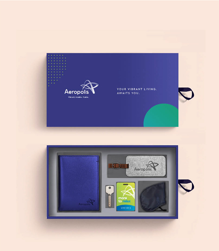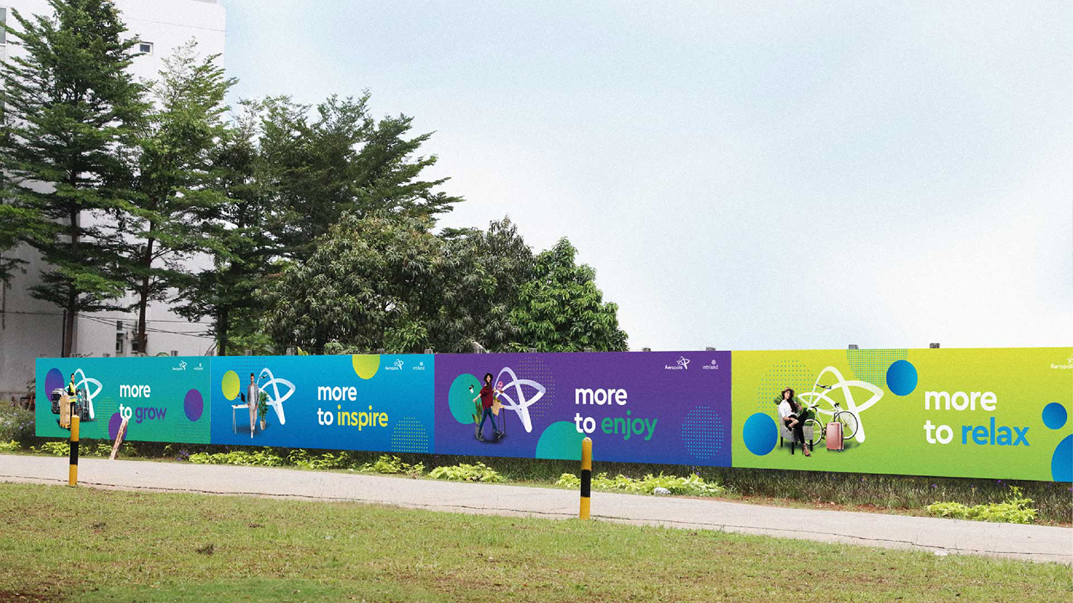
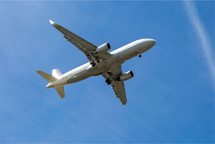
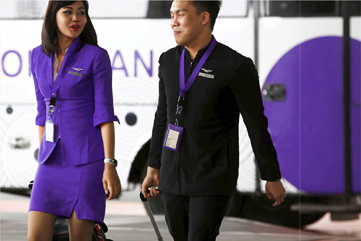

Aeropolis should envision a new spirit to make it distinct from others. WKB was challenged to create a sharp brand strategy and well-directed visuals as a conclusion for its brand image and awareness issues. It should reflect the vibrancy and livability of the locale as well as the convenience of living around the fast-paced air traffic lifestyle.
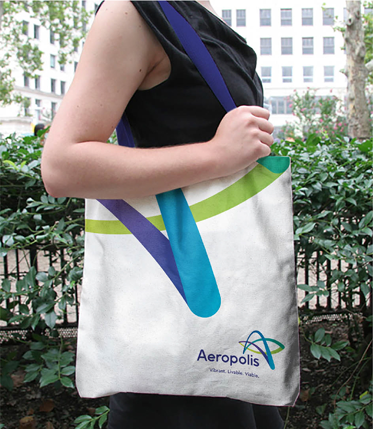
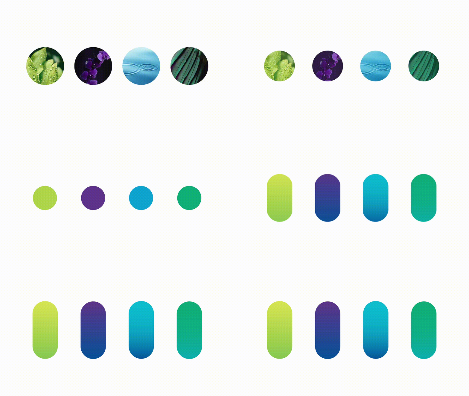
The brand platform that we formulate centred around the dynamic spirit of the airport neighbourhood. The logo is shaped with colourful strokes forming the letter ‘A’. The visuals were thoughtfully crafted to express the values of profitable business, vibrant living, and high-connectivity lifestyle; all summed up in the brand new Aeropolis.
